
Website Navigation Best Practices: 12 Ways to Improve Your Website Navigation

Your website can have a beautiful design, valuable content, and excellent services, but if visitors cannot easily find what they need, they will quickly leave and look elsewhere.
This is why understanding website navigation best practices is essential for creating a website that not only looks professional but also delivers a better user experience and supports business growth.
Website navigation acts as the roadmap of your digital presence. It helps visitors discover your services, explore your content, understand your brand, and take important actions such as contacting your business, requesting a quote, or making a purchase.
Many businesses focus heavily on visual design but overlook the structure behind how users move through their website.
A confusing menu, unclear page names, or poorly organized content can create unnecessary friction and prevent visitors from reaching your most valuable pages.
Learning how to improve website navigation allows businesses to create a smoother customer journey where every click has a clear purpose.
When visitors can quickly find your services, learn about your company, and access important information, they are more likely to stay engaged and move toward becoming customers.
On the other hand, poor navigation can create frustration, increase bounce rates, and cause potential customers to leave before discovering what your business offers.

The good news is that improving navigation does not always require rebuilding your entire website.
Small improvements such as simplifying your menu, reorganizing your pages, adding clearer calls-to-action, and improving internal linking can create significant improvements in usability and performance.
If you want to identify potential issues with your current website structure, our Free Website Audit Checklist provides a practical way to evaluate your website’s design, usability, SEO, and conversion opportunities.
For more insights into how design choices influence customer behaviour, explore our guide on How Website Design Affects User Experience.
By implementing these best practices website navigation strategies, businesses can create digital experiences that are easier to use, easier to find, and more effective at turning visitors into customers.
Why Website Navigation Matters More Than Most Businesses Realize
Your website may have a modern design, high-quality content, and excellent products or services, but if visitors struggle to find information, those efforts can quickly go to waste.
Website navigation is often one of the most overlooked aspects of web design, yet it has a direct impact on user experience, search engine optimization (SEO), and conversion rates.
Visitors expect to find what they're looking for within seconds. When they can't, they are far more likely to leave your website and continue their search elsewhere.
Following these website navigation best practices helps businesses create a website that feels intuitive, organized, and easy to explore. Instead of forcing visitors to think about where to click next, good navigation naturally guides them toward the information and actions that matter most.
Whether your goal is generating more leads, increasing online sales, or improving customer satisfaction, one of the simplest ways to improve website navigation is to design your website around how users actually browse rather than how your business is internally organized.

What is Website Navigation?
Website navigation is the system of menus, buttons, links, and page structures that helps visitors move throughout your website.
Its primary purpose is to guide users from one page to another, making it easy to discover information, learn about your business, and complete important actions such as requesting a quote, purchasing a product, or contacting your team.
Think of website navigation as the roadmap for your digital presence.
Just as clear road signs help drivers reach their destination efficiently, effective navigation helps website visitors quickly find the information they need without frustration or confusion.
Implementing strong website navigation best practices means organizing your website so visitors always understand where they are, where they can go next, and how to reach the information they're searching for.
Good navigation should feel almost invisible. Users should be able to move naturally through your website without stopping to figure out where a menu item is located or what a navigation label actually means.
Businesses looking to improve website navigation should focus on creating clear pathways that support both first-time visitors and returning customers.
Every page should contribute to a logical customer journey that builds trust and encourages engagement.

Why Website Navigation Matters for Business Growth
Website navigation affects far more than the appearance of your website.
It influences how visitors interact with your content, how search engines understand your website structure, and how effectively your website converts traffic into customers.
Businesses that follow proven website navigation best practices create a smoother experience that encourages visitors to stay longer, view more pages, and take meaningful actions.
From a user experience perspective, clear navigation reduces frustration and helps customers locate products, services, pricing, or contact information more quickly.
When people can accomplish their goals without unnecessary effort, they are more likely to trust your business and continue exploring your website.
Navigation also plays an important role in SEO.
Search engines use your navigation and internal linking structure to understand how pages relate to one another and which pages are most important. A well-organized website is generally easier to crawl, index, and rank in search results.
Businesses frequently ask, how can I improve the navigation on my website without completely redesigning it?
In many cases, small improvements can make a significant difference. Simplifying your menu, using clearer page names, improving internal linking, highlighting important pages, and creating a more logical website structure can dramatically improve both usability and conversions.
Ultimately, great navigation creates a better customer journey.

The Elements of Effective Website Navigation
Strong website navigation is built from several key components working together rather than relying on a single menu.
Every navigation element should contribute to one goal: helping visitors find information quickly while guiding them toward meaningful actions.
Businesses looking to how to improve website navigation user experience should think beyond the main menu and consider how every page connects throughout the entire website.
A complete navigation system includes the primary navigation menu, footer navigation, internal links, page hierarchy, calls-to-action, and supporting navigation elements that create a seamless browsing experience.
Understanding these foundational components is an important step in building a website that supports both customer experience and long-term business growth.
If you're planning a new website or redesigning an existing one, our Website Design Process Explained guide provides a detailed look at how navigation fits into creating a professional, user-focused website.

Main Navigation Menu
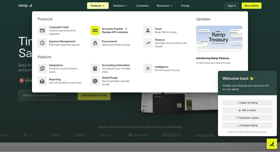
The navigation bar in website design is often the first place visitors look when they arrive on your homepage.
It serves as the primary navigation system and should immediately communicate what your business offers and where users can find important information.
A well-designed navigation menu focuses on clarity rather than creativity.
Instead of using vague labels like "Solutions" or "Resources," businesses should use descriptive page names that clearly explain what visitors can expect after clicking.
For example, "Website Design Services," "SEO Services," or "Digital Marketing" are much more informative than generic alternatives.
The main navigation should also prioritize your highest-value pages.
Important services, industries, pricing information, about pages, and contact pages should be easy to access without forcing visitors through multiple levels of navigation.
Keeping menus organized and limiting the number of top-level options reduces decision fatigue and creates a cleaner browsing experience.
When visitors can quickly understand your navigation, they spend less time searching and more time engaging with your business.

Footer Navigation
While the primary navigation receives the most attention, footer navigation plays an equally important supporting role.
Following strong navigation UX best practices means giving users multiple opportunities to find important information regardless of where they are on your website.
Many visitors scroll directly to the bottom of a page looking for contact details, business hours, service links, privacy policies, FAQs, or additional resources.
A well-organized footer acts as a secondary navigation hub that reinforces your website structure and provides convenient access to pages users commonly need.
Footer navigation is also an excellent location for linking to educational resources, service categories, career opportunities, legal pages, and social media profiles.
Rather than treating the footer as an afterthought, businesses should view it as another opportunity to improve usability, strengthen trust, and encourage visitors to continue exploring their website.

Internal Links
Internal links connect related pages throughout your website, creating pathways that help both users and search engines navigate your content.
If you've ever wondered what role do internal links play in improving website navigation, the answer is simple: they transform individual pages into a connected website experience.
Instead of forcing visitors to return to the main menu every time they want additional information, internal links naturally guide them toward relevant resources, services, and supporting content.
For example, a blog discussing website navigation can link to articles about website design, user experience, SEO, or conversion optimization. This keeps users engaged while helping them learn more about related topics that match their interests.
Internal links also strengthen your SEO strategy.
Search engines use internal links to discover new pages, understand content relationships, and identify which pages are most important within your website.
A strong internal linking strategy improves crawlability, distributes authority across your website, and helps important pages rank more effectively in search results.
To learn more about how internal linking supports search visibility, explore our Ultimate Guide to SEO, where we explain how website architecture, internal links, and content strategy work together to improve long-term organic performance.
9 Website Navigation Best Practices to Improve User Experience
Creating an attractive website is only half the battle. Once visitors arrive, they need to move through your website quickly and confidently.
The goal of improving website navigation is to reduce friction, help users find information effortlessly, and guide them toward meaningful actions such as contacting your business, requesting a quote, or making a purchase.
The following recommendations represent proven best practices for website navigation used by high-performing business websites. Whether you're building a new website or redesigning an existing one, these strategies will improve usability, support SEO, and create a better customer experience.
You'll also see several improve website navigation examples that demonstrate how small changes can have a significant impact on how users interact with your website.

Tip 1: Keep Your Navigation Menu Simple and Organized
The best navigation menus are simple enough that visitors understand them immediately.
One of the easiest ways to improve your website navigation is by removing unnecessary menu items and focusing only on the pages that matter most to your customers.
Many businesses make the mistake of trying to include every page in their main navigation. Instead of helping visitors, this often creates information overload and makes it harder for users to decide where to click next.
A cleaner navigation menu encourages faster decision-making and creates a more enjoyable browsing experience.
Good website navigation design prioritizes clarity over creativity.
Your navigation labels should clearly describe what visitors will find after clicking each link.
For example, labels like "Website Design Services," "SEO Services," or "Contact" are much more helpful than vague terms such as "Solutions" or "Explore."
Visitors should never have to guess where a menu item will take them.
Businesses with many services often organize navigation using categories and subcategories.
This is where a website with a drop-down menu can be highly effective.
Instead of displaying dozens of primary navigation items, a drop-down menu groups related pages together while keeping the main navigation clean and organized.
For example, a "Services" menu might expand to display Website Design, SEO, Google Ads, Social Media Marketing, and Branding.
This allows visitors to quickly find the specific service they're looking for without overwhelming them with too many top-level choices.
Ultimately, your navigation should answer one simple question for every visitor:
"What is the fastest path to the information I'm looking for?"
If your menu helps users answer that question within a few seconds, you're creating a much stronger user experience.

Tip 2: Create a Logical Website Structure
A well-organized website is easier for both visitors and search engines to understand.
Following best practice website navigation means creating a logical hierarchy where pages naturally flow from broad topics to more detailed information.
Think of your website like a filing system.
Your homepage introduces your business, category pages organize your content, and individual pages provide detailed information about specific services, products, or resources.
When pages are grouped logically, visitors can browse with confidence because each step feels predictable.
One of the characteristics of the best website menu structure is that it mirrors the way customers think rather than the way a business is internally organized.
For example, a digital marketing agency may organize its navigation like this:
Home → Services → SEO Services
Home → Services → Google Ads
Home → Services → Social Media Marketing
Rather than separating services by internal departments, the navigation focuses on the solutions customers are actively searching for.
A strong hierarchical navigation website example also reduces the number of clicks required to reach important pages.
Visitors should never feel like they are digging through multiple layers of menus just to find basic information.
The simpler your website hierarchy, the easier it becomes for users to navigate and for search engines to crawl your website effectively.
Creating a logical structure also benefits future website growth.
As your business expands and new pages are added, a well-planned hierarchy makes it easier to introduce additional content without making your navigation confusing or cluttered.
Tip 3: Add Mega Menus for Complex Websites
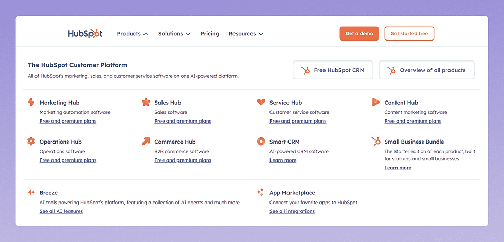
As websites grow, traditional drop-down menus may no longer provide enough space to organize content effectively.
Businesses with dozens of services, products, industries, or educational resources often benefit from using mega menus.
Unlike standard drop-down menus, mega menus display multiple categories and links within a large organized panel, allowing visitors to browse more content without feeling overwhelmed.
When implemented correctly, they represent one of the best practices for creating user-friendly website navigation on larger websites.
Mega menus are especially valuable for businesses that serve multiple industries or offer a wide range of services.
For example, a digital agency could organize a mega menu into categories such as Website Services, Digital Marketing, Industries, Resources, and Company Information.
Instead of forcing visitors to open several different menus, everything is presented within a single organized navigation experience.
Although some websites use a website with side navigation, mega menus are generally better suited for large desktop navigation systems because they provide greater visibility while maintaining a clean layout.
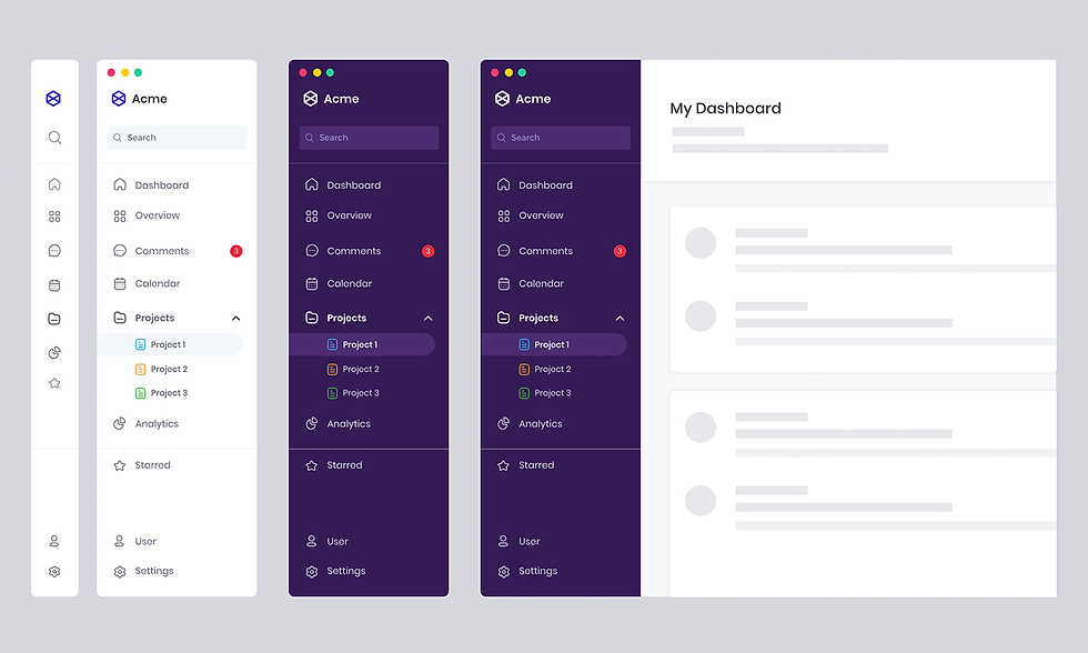
Side navigation can work well for documentation websites, software dashboards, or knowledge bases, but most business websites benefit more from a traditional top navigation combined with a well-designed mega menu.
The best menu navigation design prioritizes organization rather than quantity.
Related pages should be grouped together using clear headings, logical categories, and descriptive labels that help visitors quickly identify the information they need.
Avoid overcrowding mega menus with dozens of unrelated links, as this defeats the purpose of improving usability.
Instead, think of your mega menu as a visual sitemap that helps users understand everything your business offers at a glance.
Your navigation should expose important pages without overwhelming users with unnecessary choices.
Carefully structured mega menus accomplish this by displaying information in manageable groups that are easy to scan.
While some websites incorporate a best sidebar menu design for account dashboards or web applications, most business websites should reserve sidebar navigation for specific sections such as blogs, resource centers, or documentation libraries.
The primary website navigation should remain intuitive and immediately recognizable regardless of which page visitors enter.
Following proven mega menu best practices means limiting the number of categories, using descriptive section headings, maintaining consistent spacing, and highlighting your most valuable pages rather than every page on your website.
Good mega menus help users navigate faster without increasing visual complexity.
If you're building a website with WIX Studio, our guide on How to Create a Mega Menu with WIX walks through the process of designing a responsive mega menu that improves usability while supporting future website growth.
Tip 4: Make Your Website Navigation Mobile-Friendly
With more users accessing websites from smartphones and tablets, mobile navigation has become one of the most important aspects of modern website design.
A navigation system that works perfectly on desktop can quickly become frustrating on smaller screens if it is not properly optimized.
Visitors expect websites to load quickly, menus to be easy to open, and important pages to be accessible without excessive scrolling or searching.
Creating mobile-friendly navigation is one of the most effective ways businesses can improve website navigation and provide a smoother experience for every visitor.
The best navigation bar for website design is not necessarily the most visually complex.
Instead, it is the one that helps users quickly understand where they are and where they can go next.
On mobile devices, navigation needs to prioritize simplicity, accessibility, and speed.
There are many different types of menu bars in website designs, and the right option depends on the size and complexity of your website.
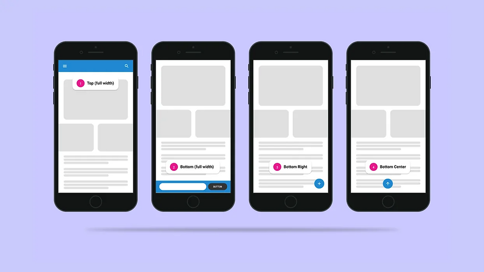
Common mobile navigation styles include hamburger menus, bottom navigation menus, slide-out menus, expandable accordion menus, and sticky mobile headers.
Each option has advantages depending on the type of website and the actions users need to take.
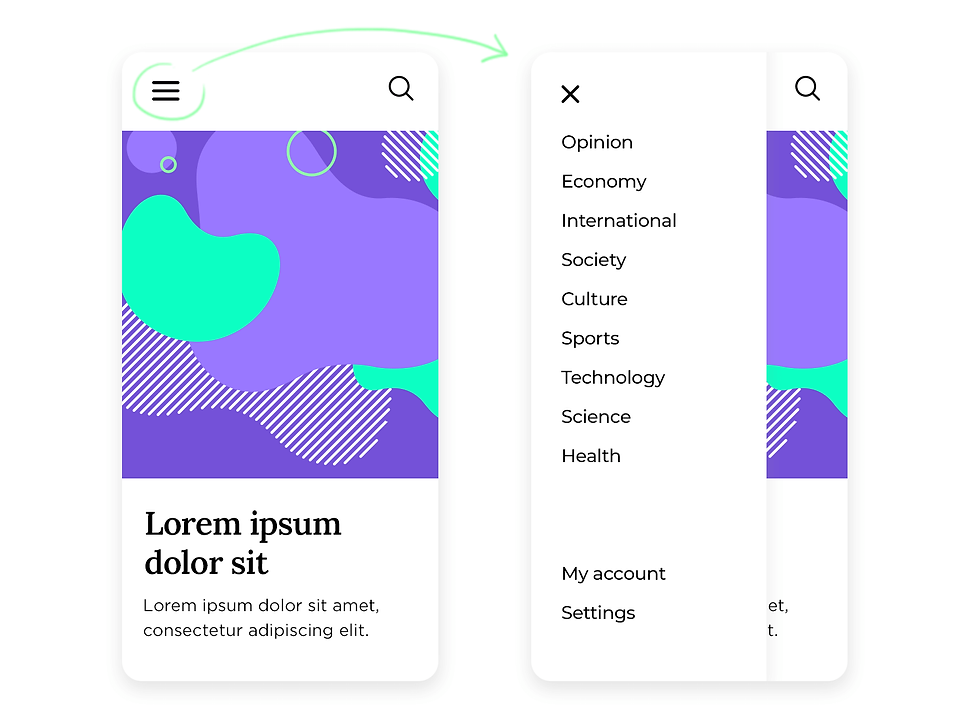
The hamburger menu is one of the most common solutions for mobile websites.
A hamburger menu uses a simple icon, usually three horizontal lines, that expands to reveal the full navigation menu when clicked.
While originally designed for mobile devices, many businesses now use hamburger menu desktop examples as well, especially for websites with extensive navigation or minimalist design styles.
However, businesses should be careful not to hide important pages unnecessarily.
If visitors need to constantly open a menu to find basic information, it can create additional friction.
A strong mobile web menu design should prioritize the pages users are most likely to need.
The goal of effective mobile website menu design is to create the same level of usability as desktop navigation while adapting to a smaller screen.
This includes ensuring buttons are large enough to tap, menu items are properly spaced, and visitors can easily return to previous pages.
A responsive navigation system should feel natural regardless of the device someone uses.
Our guide on How to Test if Your Website is Responsive explains how businesses can evaluate whether their website provides a consistent experience across desktop, tablet, and mobile devices.
Tip 5: Include a Search Function for Larger Websites
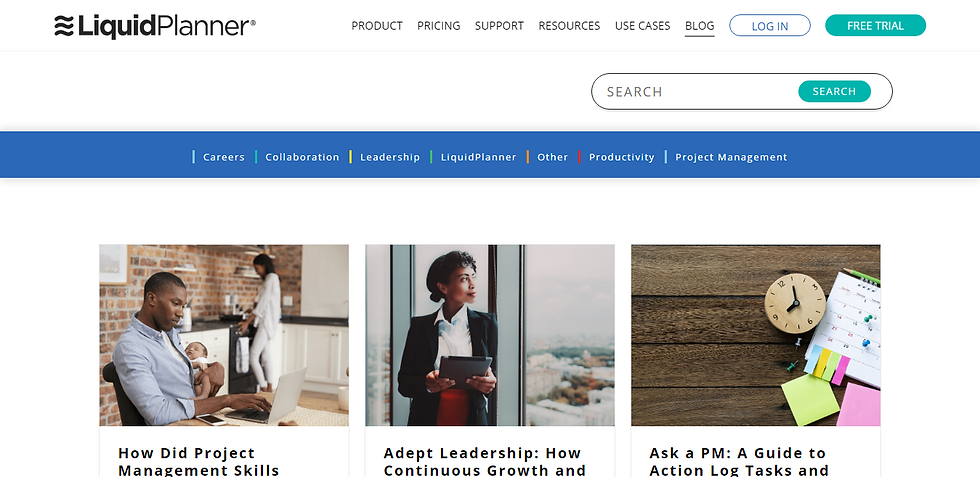
As websites grow, finding information becomes increasingly difficult without a dedicated search feature.
While navigation menus help users explore your website, search functionality allows visitors to quickly locate specific information when they already know what they need.
For larger websites, adding search is an important usability improvement that helps reduce frustration and improves the overall browsing experience.
Instead of forcing visitors to browse through multiple categories, search allows them to immediately find relevant pages.
Effective page navigation is about giving users multiple ways to discover information.
Some visitors prefer browsing through menus, while others prefer searching directly.
Providing both options creates a more flexible user experience that accommodates different browsing behaviours.
Adding search does not mean your navigation structure becomes less important.
A strong search feature should complement clear navigation rather than replace it.
The best websites combine intuitive menus, logical page structures, and search functionality to create a complete navigation experience.
Creative websites often use unique navigation approaches to stand out, but creativity should never come at the expense of usability. The best creative website navigation solutions still follow core usability principles such as understanding how users will move through the website and ensuring important information remains easy to find.

Tip 6: Highlight Important Pages and Calls-to-Action
Your website navigation should not only help visitors browse, it should also guide them toward taking action.
Every business website has specific goals.
For some businesses, the goal may be generating leads. For others, it may be selling products, booking appointments, or encouraging visitors to contact their team.
Your navigation should support these goals by making important actions easy to find.
The homepage navigation plays an especially important role because it creates the first pathway visitors use after arriving on your website.
Your homepage menu should immediately communicate what your business offers, who you serve, and where visitors should go next.
A well-designed homepage navigation system helps users quickly understand your business and discover relevant information.
One of the most effective ways to improve your website navigation is adding clear calls-to-action directly within your navigation menu.
These buttons provide a direct pathway for visitors who are ready to take the next step.
However, not every navigation item should compete for attention.
A common mistake businesses make is highlighting too many options equally.
When every link appears important, nothing stands out.
Instead, prioritize your primary conversion action and make it visually distinct.
Strategic navigation helps guide visitors through the customer journey.
A new visitor may start by learning about your services, reading educational content, and eventually reaching your contact page.
Your navigation should support each stage of that journey by making the next logical step easy to discover.

Tip 7: Use Breadcrumb Navigation for Better User Experience
Breadcrumb navigation is a simple but powerful website feature that helps visitors understand where they are within your website structure.
Similar to a trail of breadcrumbs leading back to the starting point, breadcrumb navigation shows users the path they took to reach a specific page.
Home → Services → Digital Marketing → SEO Services
This provides immediate context and allows visitors to easily return to previous sections without repeatedly using the main navigation menu.
A strong navigation system for a website should help visitors understand both their current location and their available options.
While your primary menu helps users move between major sections, breadcrumbs provide additional guidance when visitors are exploring deeper pages.
One of the benefits of using breadcrumbs is that they reduce user frustration.
Visitors often enter websites through search engines, meaning they may land directly on an internal page rather than the homepage.
Without clear context, users may not understand where that page fits within your website.
Breadcrumbs solve this problem by showing the relationship between pages and making it easier for visitors to explore related content.
Following website menu design best practices means creating multiple pathways that help users navigate your website naturally.
Breadcrumbs should complement your primary navigation rather than replace it.
Breadcrumbs can also support SEO by helping search engines better understand your website hierarchy.
When implemented correctly, breadcrumb markup provides additional context about your page structure and can improve how your website appears in search results.
This makes breadcrumbs valuable for both users and search engines.
A well-designed website should not force visitors to rely on the back button or repeatedly search through menus.
By adding breadcrumb navigation, businesses can improve website UX and create a more intuitive experience that keeps visitors engaged.
When evaluating the best web menu design, remember that great navigation is not only about the main menu at the top of your website.
Every element that helps users move through your website contributes to the overall navigation experience.
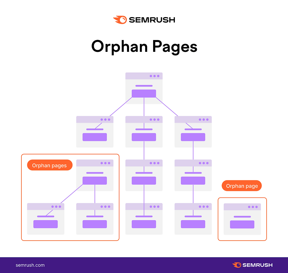
Tip 8: Optimize Website Navigation for SEO
Website navigation plays a major role in how search engines understand, crawl, and rank your website.
While many businesses think of navigation as purely a design feature, it is also an important SEO component that impacts visibility and organic traffic.
A properly structured website navigation design helps search engines discover important pages, understand relationships between content, and determine which pages are most valuable.
Search engines use links throughout your website to understand your content structure.
This is why businesses should carefully consider what role do internal links play in improving website navigation.
Internal links connect related pages together, creating pathways that guide both users and search engines through your website.
These connections help visitors discover more valuable information while also signaling to search engines how different pages relate to each other.
A strong SEO-focused navigation strategy includes creating clear pathways to your most important pages.
Your highest-value pages, such as service pages, product pages, and conversion-focused landing pages, should be easy to access through main navigation, internal links, footer links, and supporting content.
Pages that are buried too deeply within your website structure may receive less visibility from both users and search engines.
Good navigation also improves engagement metrics that can indirectly support SEO performance.
Businesses looking to improve website user experience should view SEO and usability as connected strategies rather than separate efforts.
A website designed for search engines but frustrating for users will struggle to generate long-term results.
Likewise, a beautiful website with poor structure may make it difficult for search engines to understand its content.
The strongest websites balance technical SEO, user experience, and strategic navigation.
For a deeper understanding of how website structure, content, technical performance, and other elements affect visibility, explore our guide on Top Google SEO Ranking Factors.
Tip 9: Use a Consistent Navigation Layout Across Every Page
Consistency is one of the most important principles of effective website navigation.
Visitors should not have to relearn how your website works every time they visit a new page.
A consistent navigation layout creates familiarity, builds trust, and allows users to move through your website more confidently.
Your website navigation should remain predictable across every page.
This means keeping important elements consistent, including the navigation menu placement, logo location, CTA button placement, menu labels, and footer structure.
For example, if your contact button appears in the top-right corner of your homepage, visitors should not have to search for it when they visit another page.
When businesses consider how to improve website navigation, consistency is often one of the simplest improvements they can make.
Even small changes, such as moving menu items around or renaming navigation labels across different pages, can create unnecessary confusion.
A strong website navigation system should feel familiar regardless of where someone enters.
This is especially important because many visitors do not start their journey on your homepage.
They may arrive through Google search results, social media links, online advertisements, blog content, or even other websites. Each page should provide a clear pathway to explore additional information.
Creating a consistent navigation system begins during the website planning and design process.
Businesses should carefully consider their page structure, user journeys, and navigation strategy before building their website.
Our guide on How to Choose a Website Design explains how businesses can evaluate website layouts, design styles, and functionality choices that support their goals.

Tip 10: Use Visual Hierarchy to Guide Attention
Effective website navigation is not only about where elements are placed, it is also about how those elements are visually presented.
A strong navigation system uses visual hierarchy to guide visitors toward the most important actions while making secondary information available without creating distractions.
When users navigate through website pages, they should immediately understand which options are most important and what actions they should take next.
Without visual hierarchy, every navigation item competes for attention, making the website feel cluttered and harder to use.
A well-designed modern website navigation bar balances simplicity, branding, and functionality.
Instead of displaying every option with equal importance, businesses should use design elements such as size differences, spacing, typography, button styling, and positioning. These elements help guide visitors toward the pages and actions that matter most.
Following strong website structure best practices means understanding that users do not read websites the same way they read documents.
Most visitors scan pages quickly, looking for visual cues that help them decide where to click next.
Your navigation should support this behaviour by making important information easy to identify. When every part of your website follows the same visual logic, visitors can move through your website with less effort.
Businesses should avoid designing navigation based only on what looks visually appealing.
The best navigation design combines aesthetics with strategy.
Every colour choice, button placement, and menu item should support a purpose: helping visitors find information faster and take meaningful actions.
Tip 11: Add a Sticky Navigation Bar
A sticky navigation bar keeps your main menu visible as visitors scroll through your website.
Instead of requiring users to scroll back to the top of the page whenever they want to visit another section, sticky navigation provides continuous access to important links and actions.
This simple feature can significantly improve usability, especially on longer pages such as service pages, landing pages, blogs, and product pages.
There are many different types of website navigation available, and sticky navigation is one of the most effective solutions for modern business websites.
A sticky navigation system works particularly well for businesses that rely on conversions.
For example, a visitor reading a long service page may become interested halfway through the content.
Without sticky navigation, they may need to manually search for the contact button or return to the top of the page.
A sticky header keeps important actions available throughout the customer journey.
Strong navigation menu UX requires thinking about the entire user journey. Sticky navigation supports this by reducing friction and making website interactions more convenient.
However, sticky navigation should not be added simply because it is popular.
Businesses should evaluate whether it improves the experience for their specific audience.
For websites with short pages or minimal content, a traditional navigation menu may provide a cleaner experience.
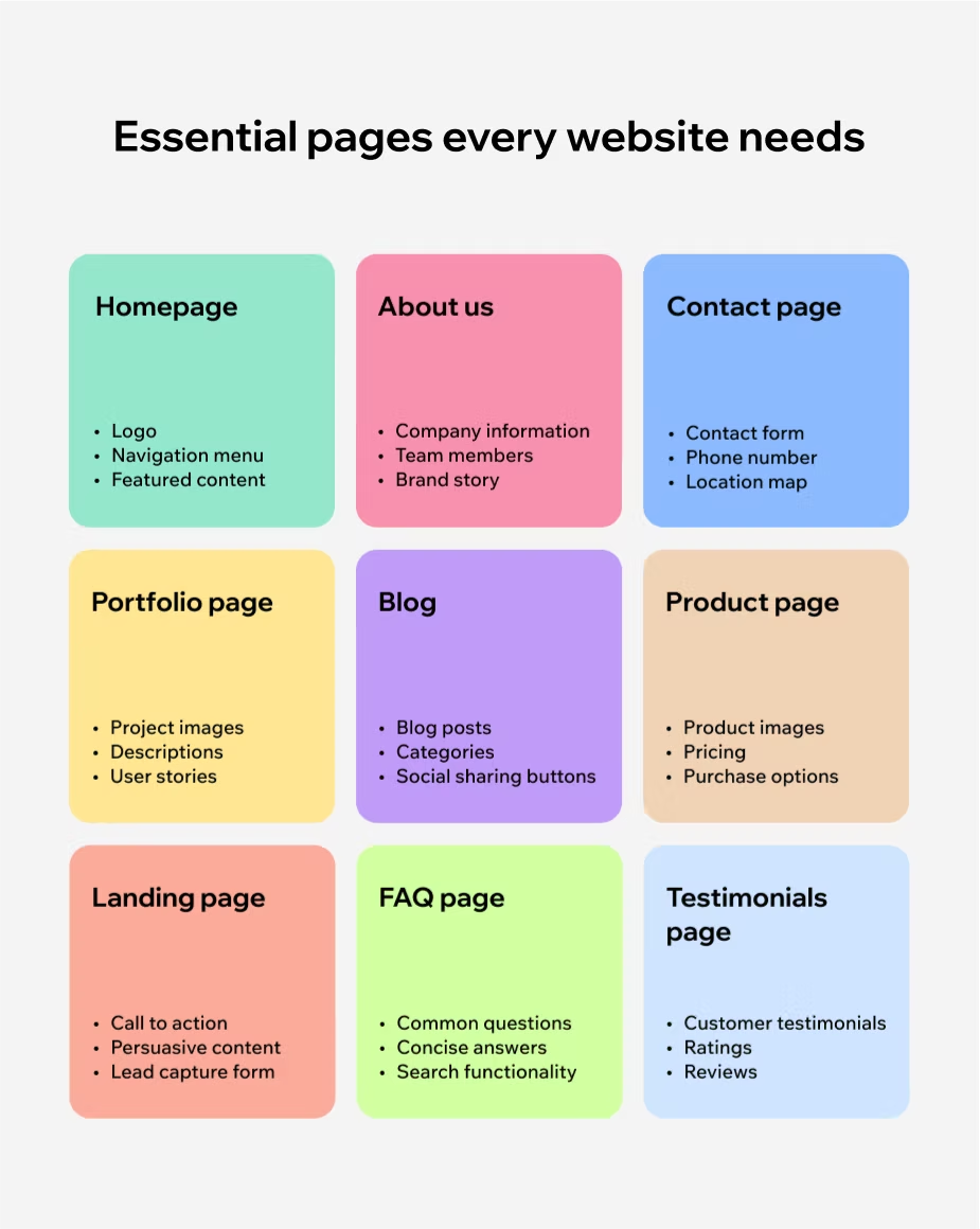
Tip 12: Make Important Pages Accessible Within Two Clicks
One of the most important principles of effective website navigation is reducing the amount of effort required for visitors to find valuable information.
Your website should make it easy for users to reach important pages without navigating through multiple layers of menus or searching through unrelated content.
A strong navigation system ensures that high-value pages are accessible within just a few clicks.
The navigation bar in website design should prioritize the pages that matter most to your customers and business goals.
These commonly include service pages, product pages, contact pages, pricing information, booking pages, and case studies. If visitors have to click through several menus before finding these pages, there is a higher chance they will leave your website.
Following effective navigation menu best practices means organizing your website around user needs rather than simply listing every available page.
For example, a service-based business should make it easy for visitors to move from:
Homepage → Services → Specific Service → Contact
This creates a natural journey that helps visitors learn about the business and take action.
The two-click principle does not mean every single page must be accessible immediately.
Large websites will naturally require deeper structures.
Instead, the goal is to ensure that important customer-facing pages are never buried too far within your website.
Supporting content, blog posts, and resource pages can exist deeper within the structure while still being connected through internal links and search functionality.
Businesses should regularly review their website analytics to understand whether visitors are finding important pages easily.
If users frequently exit pages before reaching conversion points, the navigation structure may need improvement.

How Website Navigation Impacts SEO and Conversions
Website navigation is often viewed as a user experience feature, but it also plays a critical role in how your website performs in search engines and converts visitors into customers.
A well-structured navigation system creates a clearer pathway for users while helping search engines understand the relationship between your pages.
When businesses implement effective navigation techniques, they create a website experience that supports three important goals, which include helping visitors find information faster, improving search engine visibility, and guiding users toward conversion actions.
How Website Navigation Improves SEO Performance
Search engines rely on your website structure to understand what your business offers and which pages are most important.
A clear navigation system helps search engines discover and crawl your pages more efficiently.
When your website navigation menu is organized logically, it creates a clear hierarchy between your homepage, service pages, blog content, and supporting resources.
Internal linking is one of the biggest SEO benefits of strong navigation.
When important pages are connected through navigation menus, footer links, and contextual internal links, search engines can better understand your website relationships.
Internal links also help distribute authority throughout your website.
For example, a high-performing blog post can link visitors toward relevant service pages, helping users discover more information while strengthening the overall SEO structure.
To learn more about how SEO works and how website structure impacts rankings, explore our Beginner's Guide to SEO.
A website with excellent content but poor structure may struggle to reach its full search visibility potential because users and search engines cannot easily understand how information connects.
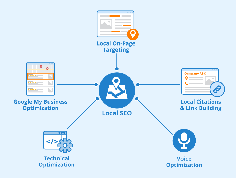
How Website Navigation Supports Local SEO
For local businesses, navigation plays an especially important role in helping customers discover location-specific services and information.
A properly structured website can help search engines understand what services your business provides, which locations you serve, and who your ideal customers are.
Businesses looking to improve their local search visibility should also ensure important location pages are easily accessible through navigation and internal links.
A hidden location page buried several clicks deep may receive less visibility compared to a page that is properly connected throughout your website.
For more strategies on improving local search visibility, explore our Ultimate Guide to Local SEO.
The strongest websites balance user experience, SEO, and conversion strategy.
Navigation should not simply help visitors move between pages. It should guide them toward discovering your value, understanding your solutions, and taking action.
A strategic website navigation menu becomes more than a design element, it becomes a growth tool that helps attract visitors, improve engagement, and generate more opportunities for your business.
Conclusion
Your website navigation is more than just a menu at the top of your website. It is the foundation that helps visitors discover information, understand your business, and take the next step toward becoming a customer.
By following these website navigation best practices, businesses can create websites that are easier to use, more effective at generating leads, and better optimized for long-term growth.
From simplifying your navigation menu and improving your website structure to optimizing mobile experiences and creating stronger internal linking pathways, every navigation decision impacts how users interact with your website.
The best websites do not make visitors think about where to click next.
Instead, they create a natural journey that guides users from discovering your business to exploring your services and completing meaningful actions.
Implementing strong navigation UX best practices helps reduce frustration, improve engagement, and create a more professional digital experience that builds trust with potential customers.
Whether you are designing a new website or improving an existing one, focusing on navigation should be a priority from the beginning.
Understanding the different navigation types in web design and when to use each approach allows businesses to create experiences that match their audience, website goals, and customer journey.
A successful website combines visual design, content strategy, SEO, and usability into one connected experience.
If you are unsure where your website navigation currently stands, our Free Website Audit Checklist can help identify opportunities to improve usability, structure, and overall website performance.
Our Beginner's Guide to Building a Website walks through the essential steps involved in creating a professional website designed to attract visitors, build credibility, and generate results.
Ultimately, the goal of effective navigation is simple: make it easier for people to find what they need.
When businesses continuously improve website navigation, they create a stronger online experience that supports customers, improves search visibility, and turns website traffic into real business opportunities.
Frequently Asked Questions (FAQ)
What makes a good website navigation?
A good website navigation system is clear, simple, and designed around the needs of users. Effective navigation helps visitors quickly find important information without confusion or unnecessary clicks.
A strong navigation structure uses descriptive menu labels, logical page organization, mobile-friendly design, clear calls-to-action, and consistent layouts throughout the website.
The best navigation systems focus on creating a smooth user journey by guiding visitors toward the information and actions that matter most.
How do I improve my navigation skills?
Improving navigation skills starts with understanding how users search for information and how websites are structured.
To improve website navigation skills, focus on learning principles such as information architecture, user experience design, website hierarchy, internal linking, and customer journey mapping.
Reviewing successful websites, analyzing user behavior through analytics tools, and testing different navigation layouts can also help you understand what makes websites easier to use.
How to make a website easy to navigate?
To make a website easy to navigate, start by organizing your pages into clear categories and creating a simple navigation menu.
Use straightforward labels that explain exactly what users will find, keep important pages easy to access, and ensure your website works well on mobile devices.
Other improvements include adding internal links, using breadcrumbs, including search functionality for larger websites, and highlighting important calls-to-action.
The goal is to reduce the effort visitors need to find information and help them move naturally through your website.
What are the golden rules of web navigation?
The golden rules of web navigation focus on creating a predictable and user-friendly experience.
The most important principles include keeping navigation simple, maintaining consistency across pages, using clear labels, prioritizing important content, making navigation mobile-friendly, and ensuring users can always understand where they are within the website.
Great navigation should feel natural and require minimal thought from visitors.
What's better for navigation?
The best navigation approach depends on the size, purpose, and complexity of your website.
For most business websites, a simple top navigation bar with clear categories and a prominent call-to-action is the most effective option.
Larger websites may benefit from solutions such as mega menus, search functionality, breadcrumbs, or sidebar navigation.
The best navigation system is the one that helps your specific audience find information quickly while supporting your business goals.
How to design website navigation?
To design effective website navigation, start by understanding your audience and identifying the most important pages visitors need to access.
Create a logical website structure, organize pages into clear categories, use descriptive navigation labels, and prioritize actions that support your business goals.
During the design process, test your navigation on different devices and analyze user behavior to identify areas for improvement.
A successful navigation design balances usability, SEO, and conversion strategy to create a website experience that guides visitors from discovery to action.


%20-%20Text%20%26%20Icon%20-%20White%20(PNG)_edited.png)
Comments