
How to Design a Logo For Your Business (Beginner’s Guide)

Your logo is often one of the first things people notice about your business.
It can appear on your website, social media profiles, business cards, signage, advertisements, packaging, vehicles, and countless other places where customers interact with your brand. A well-designed logo can help your business look established, communicate personality, and become easier to recognize over time.
But creating one isn't as simple as picking a nice font and adding an icon.
If you're searching for how to design a logo for your business, you may be wondering where to start, what type of logo you should choose, which colours and fonts to use, or whether you should create it yourself or hire a professional.
The good news is that you don't need to be a professional graphic designer to understand the fundamentals.
This guide, how to design a logo the ultimate guide, will walk you through the process from the initial strategy and brainstorming stages to choosing your logo type, colours, typography, design tools, file formats, and final testing.
We'll also cover practical options for how to design a business logo for free, including tools that can help you create and explore logo concepts without a large upfront investment.
Most importantly, we'll look beyond aesthetics.

A logo shouldn't simply look good. It should make sense for your business, connect with your target audience, work across different platforms, and remain useful as your business grows.
Your logo is also only one piece of a much larger brand.
If you're still building your overall identity, our Beginner's Guide to Building a Business Brand can help you understand how your logo, colours, typography, messaging, positioning, and customer experience fit together.
Once your brand foundation is in place, you'll need somewhere for customers to actually find and interact with it online. Our Ultimate Guide to Build Your Business's Online Presence in 90 Days (Free E-Book) provides a broader roadmap for building your website, Google presence, SEO, digital marketing, and online systems.

What Is a Logo?
A logo is one of the first visual elements people associate with a business. It can be a wordmark, symbol, combination of both, or another distinctive visual mark that helps identify a company and differentiate it from others.
But a logo is more than something you put in the corner of your website.
A well-designed logo becomes part of your business's visual identity. It appears across your website, social media profiles, business cards, signage, packaging, advertisements, presentations, and other places where customers interact with your brand.
That makes logo design an important part of building a recognizable business.
If you're learning how to design a business logo from scratch, it's important to understand that the goal isn't simply to create something that looks attractive. Your logo should communicate something about your business, work with your overall brand identity, and remain recognizable across different sizes, platforms, and applications.
Before opening a design tool or choosing colours and fonts, start by understanding what a logo is actually supposed to accomplish.

What Is the Purpose of a Logo?
The primary purpose of a logo is identification.
When customers see your logo, you want them to be able to associate it with your business. Over time, consistent exposure can make that visual connection stronger, helping customers recognize your business across different touchpoints.
Think about how often you encounter logos throughout a normal day.
You might see one on a website, another on a storefront, another on a social media post, and another on a product package. The logo acts as a visual shortcut that helps people identify who they're interacting with.
But identification is only part of the equation.
A strong logo can also help communicate your business's personality, positioning, and visual direction. A playful logo can create a very different impression from a minimalist corporate wordmark, even when both serve the same basic purpose.
This is why logo design should begin with strategy rather than decoration.
If your business serves professional clients, for example, your logo may need to communicate credibility and reliability. A children's business may benefit from a more playful visual direction. A premium brand may use typography, spacing, and simplicity to create a more refined impression.
Your logo doesn't need to explain everything about your business.
Instead, it should become a recognizable part of a larger visual system that communicates your business consistently.

Logo vs. Brand: What's the Difference?
One of the most common misunderstandings in branding is treating a logo and a brand as the same thing.
They're not.
Your logo is one component of your brand. Your brand is the broader perception and experience people have when they interact with your business.
Your logo is visual.
Your brand includes your visual identity, messaging, positioning, personality, customer experience, reputation, and the expectations customers develop around your business.
For example, imagine a local accounting firm with a clean blue logo.
The logo might help customers identify the company, but the logo alone doesn't determine whether customers see that business as trustworthy, approachable, modern, expensive, or knowledgeable.
Those perceptions are built through many different experiences.
The website design, photography, written communication, service quality, advertisements, customer service, social media content, reviews, and even the way employees communicate can all contribute to the brand.
This distinction is particularly important when learning how to design a logo design for a new business.
You shouldn't begin by asking, “What colours look cool?”
Instead, start with questions such as:
Who is the business trying to reach?
What does the business want to be known for?
What makes it different from competitors?
What personality should the brand communicate?
Where will the logo be used?
What should customers feel or understand when they encounter the business?
Those answers provide direction for the actual design.
For example, a construction company targeting commercial clients might choose a visual identity that communicates strength, precision, and professionalism. A boutique creative studio might take a completely different approach, using more expressive typography, colours, or visual elements.
Neither approach is automatically better.
The important thing is whether the design supports the positioning and audience of the business.
Your logo should therefore be treated as part of a larger brand system rather than as an isolated graphic.

Does Every Business Need a Logo?
Almost every business can benefit from having a recognizable visual identity, but that doesn't mean every business needs a complicated or highly elaborate logo.
In fact, simpler is often more effective.
A local service business, startup, freelancer, ecommerce company, restaurant, professional firm, or established corporation can all use a logo to create consistency across their marketing and customer touchpoints.
The key is making sure the logo is appropriate for the business.
If you're wondering how to create a logo for a business, start by considering what the business actually needs rather than trying to follow whatever design trend is currently popular.
A new landscaping company, for example, may not need a complex illustration containing a lawn mower, tree, house, sun, and company initials.
A simple wordmark combined with a distinctive symbol may be easier to recognize, reproduce, and use across websites, vehicles, uniforms, signage, and social media.
Similarly, a professional consulting firm may not need an elaborate icon. A carefully designed wordmark can provide a clean and credible visual identity while keeping the focus on the company's name.
A logo is most valuable when it works as part of a consistent brand experience. When the same colours, typography, imagery, messaging, and visual style are used consistently, individual elements reinforce one another.
This is also why your logo should be designed with its future applications in mind.
Before finalizing a design, consider how it will appear on your business website, social media profiles, Google Business Profile, advertisements, printed materials, signage, merchandise, and other customer touchpoints.
You want a logo that can scale with your business, not one that only looks good in the original design file.
And remember: your logo doesn't have to carry your entire brand on its own.

What Makes a Good Logo?
A good logo doesn't need to be complicated to be effective.
In fact, some of the strongest business logos are remarkably simple. What makes them work is not the number of design elements they contain, but how effectively those elements create recognition, consistency, and relevance.
When you're learning how to design a business logo, it's easy to focus on colours, fonts, icons, and visual trends. Those details matter, but they should support a bigger goal: creating a logo that represents the business clearly and continues to work as the business grows.
A strong logo should generally be simple, memorable, relevant, versatile, and timeless.
These principles provide a useful framework for evaluating a logo before you invest time and money into building the rest of your brand identity.

Simple
One of the most important principles of effective logo design is simplicity.
A simple logo is easier to recognize, remember, reproduce, and use across different marketing channels. It doesn't necessarily mean the logo has to be boring or generic. It means every element has a reason to be there.
When you're figuring out how to design a business logo, resist the temptation to include everything about the business in one graphic.
A roofing company doesn't need a house, roof, hammer, sun, clouds, and the company's initials all packed into one icon. A restaurant doesn't necessarily need a fork, knife, plate, chef's hat, and food illustration.
Trying to visually explain the entire business can quickly make a logo cluttered.
Instead, look for the simplest visual idea that can create a distinctive identity.
This is particularly important when a logo needs to appear at different sizes.
A detailed design might look impressive on a large presentation screen but become difficult to recognize when reduced to a small website header or social media profile image.
Simplicity also improves consistency.
A clean logo is generally easier to reproduce across websites, signage, apparel, print materials, advertisements, packaging, and other applications.
One useful test is to temporarily remove elements from the design and ask whether the logo becomes stronger or weaker.
If removing something doesn't change the logo's meaning or recognition, it may not need to be there.
The goal isn't to make the logo as minimal as possible.
The goal is to make it as clear as possible.

Memorable
A logo can be simple and still be forgettable.
That's why the second important characteristic is memorability.
When someone sees your logo today and encounters your business again several weeks later, you want some visual connection to remain. A memorable logo gives people something distinctive to associate with your business.
This doesn't mean your logo needs to be strange or overly creative.
Memorability often comes from a combination of distinctive typography, recognizable shapes, intentional colour choices, proportions, or a unique visual concept.
When considering how to design a logo for business, ask yourself whether the design could easily be confused with another company.
If your logo uses the same generic icon, font, and colour combination as dozens of competitors, it may technically look professional but still fail to create a strong identity.
Researching competitors is therefore an important part of the design process.
Look at the visual patterns within your industry, but don't simply copy them.
Instead, identify what customers are already seeing and determine where your business can establish a distinctive visual position.
For example, if every competitor in an industry uses blue text with a generic geometric icon, there may be an opportunity to create differentiation through typography, composition, or a more ownable visual element.
Memorability also improves through consistent use.
Even a strong logo won't become recognizable if it changes every few months. Using the same logo consistently across your website, social media, advertising, signage, and other customer touchpoints gives people more opportunities to associate that visual with your business.
Your logo doesn't have to tell your entire story.

Relevant
A logo should look good, but looking good isn't enough.
It also needs to be relevant to the business, its audience, and its positioning.
This is one of the most important considerations when learning how to design a logo for your business.
Imagine two companies: a children's entertainment business and a corporate financial advisory firm.
Both could technically use the same bright colours, playful typeface, and cartoon-style mascot. The design might be visually attractive, but it wouldn't necessarily communicate the right expectations to either audience.
Effective logo design considers context.
Your logo should make sense for the type of business you're building and the customers you're trying to reach.
That doesn't mean a financial company must have a boring logo or that a children's business must use bright colours.
It means the visual decisions should support the brand's intended personality and market position.
Ask what you want customers to associate with your business.
Do you want the brand to feel modern?
Approachable?
Premium?
Creative?
Professional?
Bold?
Those characteristics can influence the choices you make around typography, colour, shapes, imagery, and composition.
Relevance also means thinking about your industry without becoming trapped by industry conventions.
You want customers to understand what kind of business they're looking at, but you also want enough distinction to avoid looking interchangeable with every competitor.
The best logos often find a balance between familiarity and differentiation.

Versatile
Your logo won't live in one place.
It may appear on your website today and on a vehicle, storefront, social media profile, business card, promotional product, advertisement, or presentation tomorrow.
That's why versatility is one of the most practical characteristics of a good logo.
When thinking about how to design a logo for your company, don't design only for the environment where you'll use the logo most often.
Design for the entire ecosystem.
A logo should remain recognizable when it's made larger or smaller. It should work against different backgrounds and, ideally, remain effective in both colour and black and white.
This is where logo variations can become valuable.
A business may have a primary horizontal logo, a stacked version, a simplified icon, and other variations designed for specific applications.
For example, a horizontal logo might work perfectly across a website navigation bar, while a compact symbol may work better as a social media profile image.
This doesn't mean creating completely different logos.
The variations should feel like different expressions of the same visual identity.
Versatility also means considering different technical requirements.
A logo that only works in one format creates unnecessary problems later.
This is why professional logo files commonly include scalable vector formats alongside web-ready versions. Vector files can be resized without losing quality, which makes them particularly useful for printing and large-format applications.
Before approving a design, test it in the environments where your customers will actually encounter it.
A logo that looks excellent on a large monitor may not work nearly as well as a tiny profile image.

Timeless
Design trends come and go.
Your logo shouldn't need to be completely redesigned every time the design world moves in a different direction.
That is where timelessness becomes important.
When learning how to create a business logo, it's tempting to use whatever visual styles are currently popular. Trends can make a design feel modern in the short term, but they can also make it look dated surprisingly quickly.
A timeless logo focuses on creating a strong identity rather than chasing temporary aesthetics.
That doesn't mean your logo can never evolve.
Many established businesses make subtle changes to their logos over time. They may simplify a mark, adjust typography, refine colours, or modernize proportions while keeping the core identity recognizable.
The objective is evolution rather than constant reinvention.
A useful question to ask is:
“Will this design still make sense for my business five or ten years from now?”
You don't need to predict exactly what design will look like in the future.
Instead, focus on fundamentals that tend to remain useful: strong typography, intentional spacing, recognizable shapes, appropriate colour choices, and a clear concept.
Timeless design also protects the investment you're making in your brand.

The 8 Types of Logos You Can Design
Before you start sketching ideas, choosing fonts, or opening a design tool, it helps to understand the different types of logos available.
Not every logo needs to look the same.
A local contractor, technology company, restaurant, professional service firm, ecommerce brand, and creative studio may all benefit from completely different visual approaches.
Understanding the major logo categories can make the design process much easier because you can start with a direction instead of trying to invent something from nothing.
This is especially useful when exploring logo design for businesses or developing logo ideas for small business owners who may not have a background in graphic design.
And if you're researching how to start a logo design business, understanding these fundamental logo categories is essential. They form the foundation of the work you'll eventually do for different clients, industries, and brand personalities.
Here are eight of the most common logo types and how they can be used.

Wordmark Logos
A wordmark logo uses the business name itself as the primary visual element.
Rather than relying on a separate symbol, the design focuses on typography, letterforms, spacing, and composition to create a recognizable identity.
Think of a wordmark as turning the company name into the logo.
This makes typography extremely important. The choice of font, letter spacing, capitalization, weight, and proportions can completely change how the business is perceived.
A modern sans-serif typeface might create a clean and contemporary feeling, while a more traditional serif could communicate a different personality.
For business logo design, wordmarks can be particularly effective when the business has a distinctive name that the company wants customers to remember.
They're also useful for businesses that want to build recognition around their actual name rather than an abstract symbol.
A wordmark can work particularly well for professional services, agencies, consultants, technology companies, retailers, and businesses with relatively short or distinctive names.
The challenge is making the typography feel ownable.
Simply typing a company name into a standard font isn't necessarily a finished logo. The design may involve customized lettering, spacing, proportions, or other typographic details that give the wordmark its identity.
If your business name is long, difficult to read, or visually complex, another logo type may provide more flexibility.

Lettermark Logos
A lettermark uses one or more initials or letters as the primary logo.
This approach can be useful when a business has a long name or a name that is more recognizable through its initials.
For example, a company with several words in its official name may be able to create a much cleaner visual identity using its initials rather than displaying the entire name every time.
Lettermarks are therefore particularly relevant to small business logo design when the company name needs to be simplified for practical use.
The design still needs to feel distinctive.
Simply placing three initials inside a circle doesn't automatically create a memorable logo. Typography, composition, spacing, shapes, and colour can all help transform basic letters into a recognizable visual mark.
Lettermarks can also evolve over time.
A company may initially use its full name alongside the initials so customers learn the connection. As brand recognition grows, the lettermark can sometimes become more prominent.
This makes lettermarks particularly useful for businesses that expect their names or organizational structures to change, expand, or become better known through an abbreviation.

Monogram Logos
Monogram logos are closely related to lettermarks, but they typically focus on interlocking, stylized, or creatively arranged letters to form a distinctive mark.
The distinction between lettermarks and monograms can sometimes be subtle.
A lettermark may simply present initials clearly, while a monogram often treats those letters as a graphic composition.
This can create an elegant and highly recognizable visual mark.
If you're wondering how to make a logo for your business, a monogram can be worth considering when your business name has strong initials that can be transformed into an interesting shape.
Monograms can work particularly well for businesses where sophistication, heritage, or personalization is important.
They're commonly associated with professional firms, luxury brands, fashion, hospitality, personal brands, and businesses built around an individual's name.
The biggest challenge is legibility.
A clever monogram isn't useful if customers can't tell what the letters actually represent.
The design should strike a balance between creativity and recognition, particularly when the logo will appear at small sizes.

Symbol or Icon Logos
A symbol or icon logo uses a recognizable visual symbol as the primary identifier.
Unlike a wordmark, the business name isn't necessarily the central part of the logo.
The symbol might represent an object, concept, idea, or visual metaphor associated with the business.
This approach can create a highly recognizable identity, but it usually requires more strategic thinking.
If you're researching how to create a business logo, it's important to remember that an icon doesn't have to literally depict what the business sells.
A landscaping company doesn't necessarily need a tree.
A cybersecurity company doesn't necessarily need a padlock.
A bakery doesn't necessarily need a cupcake.
Literal imagery can work, but it can also make a business look similar to dozens of competitors.
A more distinctive symbol can communicate the brand concept without simply illustrating the service.
Symbol logos can become particularly powerful as a business grows because the icon can be used independently across digital and physical applications.
However, this type of logo can take time to build recognition.
Customers need to learn that the symbol belongs to your business.
That's why a symbol is often initially paired with the company name before eventually becoming recognizable on its own.
There isn't a single best logo type for a business.
The right choice depends on the business name, audience, positioning, industry, intended applications, and long-term brand strategy.

Abstract Logos
An abstract logo uses non-literal shapes, forms, or visual compositions to represent a business or concept.
Instead of drawing a recognizable object, the design creates an original symbol that can communicate an idea through shape, movement, colour, or composition.
This gives businesses considerable creative freedom.
An abstract logo doesn't have to tell customers exactly what the company does. Instead, it can communicate characteristics such as innovation, movement, connection, growth, precision, energy, or creativity.
For someone researching how to create a logo for your company, abstract design can be particularly interesting when the business operates in a category where literal symbols are already overused.
Technology companies, creative agencies, financial companies, consulting firms, and other modern businesses sometimes use abstract marks to create a more distinctive identity.
The downside is that abstract logos can be difficult to design well.
Because the symbol isn't immediately recognizable as a specific object, the surrounding brand experience becomes even more important.
The colour palette, typography, messaging, website design, and marketing all help give the abstract mark meaning.
A successful abstract logo therefore doesn't necessarily need to explain the business immediately.
It needs to become associated with the business over time.
Mascot Logos
Mascot logos use a character or illustrated figure as the central visual identity.
They can make a business feel more approachable, energetic, playful, or personable.
This makes them particularly common among restaurants, sports organizations, entertainment companies, food brands, children's businesses, gaming brands, and businesses that want a more expressive personality.
A mascot can also become a marketing asset beyond the logo itself.
The character might appear in social media content, advertisements, packaging, merchandise, website graphics, or promotional campaigns.
That creates opportunities to build a more recognizable and engaging visual identity.
However, mascot logos can become overly detailed.
A character with dozens of tiny visual elements may look great on a large poster but become difficult to recognize when reduced to a small digital graphic.
If you're considering how to make a logo for a company using a mascot, design for the smallest realistic application as well as the largest.
The character should remain identifiable without requiring customers to inspect every detail.
A mascot should also reflect the personality of the business.
A serious professional services company may need a very different character strategy from a family entertainment business.

Emblem Logos
An emblem logo places text and imagery inside a contained shape or badge-like structure.
The result often feels established, traditional, official, or institutional.
Emblems are commonly associated with schools, clubs, sports organizations, breweries, automotive brands, government-related organizations, and businesses that want to communicate heritage or tradition.
A circular badge, shield, crest, or seal can create a strong sense of structure and authority.
This can make emblems an appealing option when developing how to make a good business logo for a brand that wants a more traditional visual personality.
The main consideration is complexity.
Because emblem logos often contain multiple elements, text, and decorative details, they can become difficult to read at smaller sizes.
A modern approach may therefore simplify the emblem so the core shape remains recognizable while unnecessary details are removed.
This is another reason to test logos at multiple sizes before finalizing them.
An emblem that looks excellent on a storefront sign may not work as a tiny social media profile image without a simplified variation.

Combination Mark Logos
A combination mark combines text and a symbol or icon into one logo system.
For many businesses, this provides an excellent balance between recognition and flexibility.
The business name helps customers understand who the company is, while the symbol provides a visual element that can eventually become recognizable independently.
A combination mark might place the symbol beside the company name, above it, or integrate the two elements into a unified composition.
This format also provides flexibility as the business grows.
The full combination can be used when introducing the brand to new customers, while the symbol can potentially be used independently in situations where space is limited.
For example, a business might use the complete logo on its website and signage but use the symbol as a social media profile image or favicon.
This makes combination marks especially useful for logo design for small business, where a company may need one identity to work across a wide variety of applications.
The key is ensuring the two elements work together.
The icon shouldn't feel like a random graphic placed beside the company name. The typography, proportions, spacing, colour, and visual style should make the entire mark feel like one cohesive identity.
Which Logo Type Should You Choose?
Understanding the eight major logo types is only the beginning.
The next question is which approach makes sense for your business.
There's no universal formula.
A wordmark might be ideal for a business with a short, distinctive name. A lettermark could make sense for a company with a long name. An abstract symbol may help a modern company differentiate itself, while a mascot could be a better fit for a brand built around personality and entertainment.
For many new businesses, a combination mark can provide useful flexibility because it establishes the company name and a visual symbol at the same time.
But even that isn't automatically the right answer.
The best approach depends on your brand positioning, audience, business name, industry, personality, applications, and long-term goals.
Before choosing a logo type, consider where your logo will appear, how customers will encounter it, how much information needs to be communicated visually, and whether the design can remain recognizable as your business grows.
Before You Design a Logo
One of the biggest mistakes businesses make with logo design is starting with the design itself.
They open Canva, browse a few templates, pick a font they like, experiment with colours, and eventually end up with something that looks fine, but doesn't necessarily represent the business.
If you're learning how to design a logo for a small business, the design tool should actually be one of the last things you open.
Before you start sketching symbols or choosing typography, you need to understand the business you're designing for.
This is especially important for logo design for startups. A startup's logo isn't just a graphic to put on a website. It becomes part of the company's first impression, marketing materials, social profiles, presentations, advertisements, and customer experience.
The strongest logos are built from a foundation of strategy.
That means understanding who the business serves, what it stands for, how it wants to be perceived, and how it is different from competitors.
Your logo should be a visual expression of those decisions, not a replacement for making them.
And because your logo will eventually work alongside your website, advertising, SEO, social media, and other marketing channels, it helps to think about the logo as one component of your broader digital ecosystem.
For example, understanding the customer journey can help you make better branding decisions. Our guide on How to Build a Digital Marketing Funnel explains how customers move from discovering a business to taking action, which is useful context when considering where and how your visual identity will appear throughout that journey.
Before designing your logo, work through the following steps.

Choose Your Brand Name
Before you can design a logo, you need to know exactly what name you're designing around.
This sounds obvious, but businesses sometimes begin the logo process before they've fully committed to their brand name.
That's backwards.
Your business name can have a significant impact on the type of logo you create.
A short, distinctive name may work beautifully as a wordmark. A long business name might benefit from a lettermark or combination mark. A business built around a founder's name may have completely different opportunities for typography and monogram design.
If you're thinking about how to create a logo for your small business, start by asking whether your business name is actually ready to become a brand.
Consider how it sounds when spoken.
How easy is it to spell?
How easy is it to remember?
Does it clearly differentiate you from competitors?
Will it still make sense if the business expands into new products, services, or locations?
You should also consider how the name will appear visually.
Some names naturally lend themselves to strong typography, initials, or visual wordplay. Others may require a supporting symbol to create a more distinctive identity.
Your logo should never have to compensate for a business name that hasn't been properly considered.
The name and logo need to work together.

Define Your Target Audience
Your logo isn't designed for you.
It's designed for the people you want to recognize, remember, and ultimately trust your business.
That's why defining your target audience should happen before making major visual decisions.
Start by understanding who your ideal customers are and what matters to them.
What problems are they trying to solve?
What alternatives are they considering?
What characteristics do they look for in a business?
What brands already appeal to them?
The answers can influence the visual direction of your logo.
For example, a business targeting established corporate clients may need a different visual personality from a business targeting young consumers.
That doesn't mean there are rigid rules about which colours, fonts, or logo types belong to specific audiences.
It means your design choices should be intentional.
A logo that reflects your audience's expectations can make your business feel more relevant from the first interaction.
This becomes particularly important online.
Someone may encounter your logo for only a few seconds while scrolling through social media, reviewing Google search results, visiting your website, or seeing a digital advertisement.
Your visual identity needs to make sense quickly.
Understanding your audience helps you make those seconds count.

Define Your Brand Personality
If your business were a person, how would it communicate?
Would it be professional and polished?
Friendly and approachable?
Bold and energetic?
Minimal and sophisticated?
Traditional and established?
Creative and unconventional?
These questions help define your brand personality.
Brand personality gives your visual identity a consistent character. It helps determine whether your logo should feel modern, playful, authoritative, premium, technical, welcoming, or something else entirely.
This is especially useful when exploring how to design your own company logo.
Without a defined personality, design decisions tend to become subjective.
You might choose a font because you personally like it. You might choose a colour because it looks good on your screen. You might select an icon because it feels interesting.
But liking a design doesn't necessarily mean the design is right for the brand.
Instead, create a small set of personality characteristics that describe how you want the business to be perceived.
For example, a technology company might want to appear innovative, intelligent, and approachable.
A premium interior design studio might want to communicate refinement, creativity, and sophistication.
A local trades business might prioritize reliability, expertise, and straightforward service.
Those characteristics provide a filter for design decisions.
If a potential logo doesn't support the personality you're trying to communicate, it may not be the right direction, even if it looks attractive.
This is also where small business logo ideas should come from.
Instead of searching endlessly for inspiration and copying visual trends, start by translating your brand personality into visual characteristics.
That gives you a much stronger creative starting point.

Define Your Brand Positioning
Brand personality describes how your business feels.
Brand positioning describes where your business fits in the market and why customers should choose it.
Before you figure out how to come up with a brand logo, you should understand what makes your business different.
Consider the market you're entering.
Who are your competitors?
What do they emphasize?
What do customers expect from businesses in your category?
Where is there an opportunity for your business to stand apart?
Your logo doesn't need to communicate your entire positioning statement.
But it should support the position you're trying to establish.
Imagine two companies offering similar services.
One wants to compete as a premium, highly specialized provider.
The other wants to compete as an accessible, straightforward option for small businesses.
Both could use the same generic logo style, but a strategic visual identity can help reinforce the different positions they're trying to occupy.
This is why professional logo design for small business should begin with business strategy rather than decoration.
A professionally designed logo isn't simply more polished.
Ideally, the design process considers the business's market, audience, positioning, applications, and long-term goals before visual concepts are developed.
Your positioning can also help determine how much differentiation you need.
If your industry is dominated by nearly identical logos, creating something visually distinctive may be particularly important.
If your category has very diverse visual identities, you may have more freedom to establish a unique direction.
Either way, the logo should support the position you want your business to own in the customer's mind.
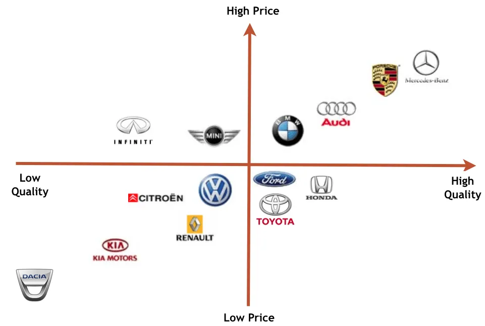
Research Your Competitors & Identify Opportunities to Differentiate
Once you understand your audience and positioning, look at what your competitors are doing.
This isn't an invitation to copy them.
It's the opposite.
Competitor research helps you understand the visual landscape your customers are already seeing.
Search for businesses offering similar products or services.
Look at their websites, social media profiles, advertisements, storefronts, packaging, signage, and other customer-facing materials.
Pay attention to recurring patterns.
Are most competitors using similar colours?
Are they relying on the same symbols?
Are they using similar fonts?
Do their logos all have the same structure?
Are certain visual clichés appearing repeatedly?
These patterns can reveal opportunities.
For example, if almost every company in your industry uses a blue shield icon, creating another blue shield may make your business blend into the category.
You might instead find a way to communicate the same underlying idea through typography, composition, an abstract symbol, or another visual concept.
This is one of the most important considerations when learning how to make a business logo design that actually helps a company stand out.
The goal isn't to be different just for the sake of being different.
If everyone in your industry uses blue and you decide to use neon green simply because nobody else does, that doesn't automatically make the design strategically stronger.
Differentiation should still make sense for your audience and positioning.
The better question is:
“What visual territory can our business own that is both relevant to our customers and distinct from competitors?”
That might mean taking a different approach to typography.
It could mean developing a unique symbol.
It could involve simplifying the visual identity while competitors are using complicated graphics.
Or it could mean finding a subtle visual idea that connects directly to what makes the business different.
Competitor research should therefore give you direction, not imitation.
How to Design a Logo Step by Step
Now that you understand what makes a logo effective and the different logo types you can choose from, it's time to get into the actual design process.
Learning how to design a logo for your business isn't about opening a design program and immediately creating something.
The strongest process starts with strategy, moves into creative exploration, and finishes with testing and preparation for real-world use.
Whether you're creating a logo for a new company, refreshing an existing identity, or learning how to design a logo for a small business, the same fundamental principles apply.
You need to understand what you're designing, who you're designing it for, and where the finished logo will be used.
Then you can turn those decisions into a visual identity that is recognizable, relevant, versatile, and built to last.
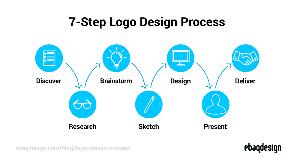
Here's a step-by-step process you can follow.
Step 1: Write Down Your Logo Requirements
Before designing anything, create a simple logo design brief.
This document doesn't need to be complicated. Its purpose is to establish the requirements and strategic direction for the logo before you start making visual decisions.
Start with the basics.
Write down the business name, tagline if applicable, industry, products or services, target audience, brand personality, positioning, competitors, and primary logo applications.
You should also document practical requirements.
Will the logo primarily be used online?
Will it appear on signage or vehicles?
Will it be printed on merchandise or packaging?
Does it need to work inside a website header?
Will it need to fit into a social media profile image?
Thinking through these applications early can influence the type of logo you create.
For example, a very wide logo may look excellent on a website but be difficult to use on a square social media profile.
If you're building a new company, it's also important to separate the question of how to create a business name and logo.
Your business name should be established before you invest heavily in logo design because the name itself can influence the visual direction.
Once the name is finalized, you can focus on how to create logo for small business needs around that identity.
Your brief should also include a few words describing the desired personality.
For example:
Professional. Approachable. Modern. Reliable.
These words give you a reference point when evaluating design concepts later.
Instead of asking, “Do I like this logo?” you can ask a much better question:
“Does this logo communicate what we decided the brand should communicate?”
That makes the design process considerably more objective.

Step 2: Choose Your Logo Type
Next, decide which logo format best fits the business.
As discussed earlier, your options include wordmarks, lettermarks, monograms, symbols, abstract marks, mascots, emblems, and combination marks.
There isn't a universal answer.
The right format depends on the business name, audience, industry, positioning, and intended applications.
If the company has a short and distinctive name, a wordmark could be a strong starting point.
If the business name is long, a lettermark might provide a cleaner solution.
If the business needs a visual symbol alongside its name, a combination mark may provide more flexibility.
If you're researching how to get a business logo, don't start by choosing whatever logo format looks most impressive.
Start by asking which format gives the business the best foundation for recognition.
Similarly, when learning how to make logos for a business, remember that the logo type is only the framework.
The actual effectiveness will come from how well the typography, shapes, colours, proportions, and overall concept work together.
You can revisit this decision later.
A logo concept may evolve from one format into another during the design process, particularly as you experiment with different ideas.

Step 3: Brainstorm Logo Ideas
Now it's time to generate concepts.
But don't immediately start designing polished logos.
Start with ideas.
Write down words, concepts, symbols, associations, metaphors, characteristics, and visual directions related to the business.
Think about what makes the company different.
What does it sell?
What problem does it solve?
What does it want to be known for?
What ideas could visually represent those characteristics?
If you're trying to figure out how to get a business logo made, this brainstorming stage is where much of the strategic thinking should happen.
For beginners, it's also helpful to avoid limiting yourself to the first idea that comes to mind.
If you're learning how to design a logo for beginners, create several directions before deciding which one deserves further development.
For example, a landscaping company could explore concepts around growth, natural shapes, property transformation, movement, craftsmanship, or outdoor environments.
The final logo doesn't necessarily need to contain a literal tree or leaf.
Brainstorming helps you move beyond the most obvious visual solution.
Look at competitor logos as well, but use them to understand the visual landscape rather than copy their designs.
You're looking for opportunities to be recognizable within your category without becoming visually interchangeable.
At this stage, quantity can be useful.
Create several rough directions.

Step 4: Choose Your Logo Colours
Colour is one of the most noticeable aspects of a logo, which makes it an important strategic decision.
But choosing logo colours shouldn't simply come down to picking your favourite colour.
Your colour palette should support the personality, positioning, audience, and overall visual identity of the business.
If you're learning how to get a custom logo made, colour should be considered as part of the brand strategy rather than added at the very end.
How to Choose the Right Logo Colours
Start by considering the personality you want the brand to communicate.
Do you want the business to feel energetic?
Trustworthy?
Premium?
Natural?
Creative?
Modern?
Approachable?
Different colour families can create different visual associations, but context matters.
There is no universal rule that says one colour always means one specific thing.
Your audience, industry, culture, colour combinations, saturation, brightness, and overall design all influence how colours are perceived.
Start with a primary brand colour and then determine whether supporting colours are needed.
A logo doesn't need five or six colours to be effective.
In many cases, a limited palette creates a cleaner and more recognizable identity.
You should also consider whether the logo works without colour.
If the design completely falls apart when converted to black and white, the concept may be relying too heavily on colour to create recognition.
Common Colour Associations in Branding
Colour psychology is useful as a starting point, but it shouldn't be treated as a rigid formula.
Blue is often associated with characteristics such as trust, stability, professionalism, and reliability, which helps explain why it is common among financial, technology, healthcare, and professional service brands.
Green can be associated with nature, growth, sustainability, health, and freshness.
Red can communicate energy, urgency, passion, or boldness.
Orange can create associations with enthusiasm, friendliness, creativity, or energy.
Yellow can feel optimistic, energetic, and approachable.
Purple is often associated with creativity, imagination, luxury, or sophistication.
Black can create a sense of simplicity, sophistication, authority, or premium positioning.
White can communicate simplicity, cleanliness, openness, and minimalism.
These associations are not rules.
A colour's effect depends heavily on how it is used.
A dark blue can create a very different impression from a bright electric blue. A muted green can communicate something very different from an intense neon green.
The combination matters just as much as the individual colour.
Consider Contrast and Accessibility
A logo also needs to remain readable.
If your text and background colours have insufficient contrast, the logo can become difficult to see for many users.
This matters particularly in digital environments where your logo may appear on different backgrounds, devices, and screen settings.
Test your logo against both light and dark backgrounds.
Also create a black version and a white or inverted version to make sure the underlying design remains recognizable without relying on colour.
Accessibility should be considered alongside aesthetics.
Your logo isn't only being viewed by someone sitting in front of a large monitor. It may appear as a tiny profile image, printed document, website header, mobile screen, or sign viewed from a distance.
The simpler and clearer the design, the easier it is to maintain recognition across those situations.

Step 5: Choose Your Logo Typography
If your logo contains words or letters, typography becomes one of its most important design components.
The typeface you choose can dramatically influence the personality of the entire logo.
When learning how to make your own brand logo, don't choose a font simply because it looks attractive on its own.
Consider how the font works with the business name, symbol, audience, industry, and overall brand personality.
Typography should support the identity rather than compete with it.
How to Choose the Right Font for a Logo
Start with your brand personality.
A professional financial firm may need typography that feels structured and established.
A creative business may have more freedom to experiment with distinctive lettering.
A technology company may lean toward a clean and modern typographic direction.
A luxury brand may benefit from carefully controlled typography and spacing.
The goal is not to find the “best” font.
It's to find typography that supports the specific identity you're building.
Pay attention to legibility, spacing, proportions, letter shapes, and scalability.
A font that looks beautiful at a large size may become difficult to read when the logo is reduced.
Serif vs. Sans-Serif Logo Fonts
Serif fonts include small decorative strokes at the ends of letterforms.
They can create associations with tradition, sophistication, authority, or editorial design.
Sans-serif fonts don't have those decorative strokes and often create a cleaner, more contemporary appearance.
They can work particularly well for modern, minimalist, technology, professional service, and digital-first brands.
Neither is inherently better.
The decision should be based on the personality and positioning of the business.
You can also combine typographic styles carefully, but too many fonts can quickly make a logo feel inconsistent.
Display Fonts
Display fonts are designed to attract attention.
They can include highly stylized, decorative, handwritten, condensed, geometric, or unusual letterforms.
These fonts can create a distinctive personality when used appropriately.
However, distinctive doesn't always mean effective.
An overly decorative font can reduce readability or make a logo feel tied to a particular design trend.
Use display typography when it contributes something meaningful to the brand rather than simply because it looks interesting.
Custom Typography
For businesses that want a highly distinctive identity, typography can sometimes be customized.
This could involve modifying individual letterforms, adjusting spacing, combining elements, or creating entirely custom lettering.
Custom typography can make a wordmark significantly more ownable because the design isn't simply based on an existing typeface.
It can also create subtle details that become part of the brand's identity.
This level of customization is generally more appropriate for businesses making a significant investment in professional branding, but the principle is useful even for DIY designers:
Don't underestimate the power of typography.
The right type treatment can turn a simple business name into a recognizable brand asset.

Step 6: Sketch Your Initial Concepts
Now take your strongest ideas and start sketching.
You don't need to be an illustrator.
The purpose of sketching isn't to produce a finished logo. It's to explore ideas quickly without becoming distracted by colours, spacing, software tools, or technical details.
If you're learning how to create a logo for your brand, sketching allows you to focus on the underlying concept.
Try different arrangements.
Combine initials with shapes.
Experiment with symbols.
Test horizontal and stacked compositions.
Simplify complicated ideas.
Don't worry if your first sketches look rough.
That's exactly what they're supposed to look like.
The goal is to discover the concept underneath the visual execution.
This is also where you can begin comparing ideas against the five principles discussed earlier: simple, memorable, relevant, versatile, and timeless.
If a concept requires an explanation every time someone sees it, it may need more refinement.
If you're learning how to design a professional logo, remember that professional design isn't about avoiding experimentation.
It's about knowing how to refine experimentation into a deliberate final result.

Step 7: Build the Logo Digitally
Once you've selected your strongest concepts, recreate them digitally.
This is where you refine typography, geometry, spacing, alignment, proportions, colour, and overall composition.
If you're learning how to make a logo for a small business, you don't necessarily need expensive professional software to get started.
The right tool depends on your skill level, requirements, budget, and desired level of control.
For simple logos, browser-based tools can be sufficient.
For more advanced identity work, professional vector design software provides considerably more control.
The important thing is to maintain the principles established earlier.
Don't let the software dictate the design.
The software is the tool.
The strategy is what gives the design direction.
But when a logo is going to become a major long-term business asset, the additional control can make a meaningful difference.
For other useful tools that can support the broader research and marketing process, check out our Top Free Digital Marketing Tools.

How to Design a Logo in Canva
Canva can be a free option for beginners who want to create a simple logo without learning professional design software.
It can be particularly useful for entrepreneurs testing an initial brand concept or creating basic visual assets themselves.
If you're exploring how to create a logo for a small business, here's a simple process.
Step 1: Create a New Logo Project
Start a new design and search for a logo project or create a custom design.
You can begin with a blank canvas if you already have a concept, or explore templates for inspiration.
If you use a template, treat it as a starting point rather than a finished identity.
Customize the typography, colours, layout, and visual elements so the final design actually reflects your business.
Step 2: Choose Your Dimensions
Choose dimensions that give you enough working space to build the logo clearly.
The exact dimensions are less important than ensuring your final logo can be exported and adapted for different applications.
Remember that the logo itself should remain scalable.
A large canvas does not automatically make a logo scalable if the underlying artwork is raster-based.
Step 3: Add Typography and Shapes
Add your business name, selected typography, and any supporting shapes or icons.
Pay close attention to spacing.
Small adjustments to letter spacing, alignment, proportions, and positioning can make a surprisingly large difference.
Avoid adding elements simply because the canvas feels empty.
Whitespace is part of the design.
If the logo feels crowded, simplify it rather than continuing to add visual elements.
Step 4: Download Your Logo
Once you've finalized the design, export versions appropriate for your intended applications.
For digital use, you may need a transparent-background PNG.
If your tool and plan support vector export, retain a vector version as well.
You'll likely need multiple variations rather than one single file.
That becomes particularly important if you plan to design logo for business for free and are trying to create assets that will work across websites, social media, documents, and print materials.
A transparent PNG can be useful for a website, while a high-quality vector version is much more flexible for applications such as design logo for business cards, signage, and other printed materials.

How to Design a Logo in ChatGPT
If you're wondering how to design a logo with AI, ChatGPT can be a useful starting point for brainstorming, developing creative directions, and exploring visual concepts.
It can help you move from “I need a logo” to a much clearer idea of what your logo should look and feel like. However, AI-generated concepts should generally be treated as starting points rather than automatically finished professional logos.
Here is a practical process for using ChatGPT to develop your logo.
Step 1: Give ChatGPT Your Brand Information
Start by giving ChatGPT enough information to understand your business.
Explain your business name, what you sell, who you serve, your industry, your brand personality, your positioning, and what makes your business different.
You can also provide examples of brands you like and explain what you like about their visual identity.
The more useful context you provide, the more relevant the creative direction will be.
You could provide your business name, target audience, personality, colours, competitors, and desired style before asking ChatGPT to develop concepts.
This is especially useful when learning how to create your own logo for business, because the process forces you to think about your brand before jumping straight into design.
Step 2: Ask ChatGPT to Develop a Creative Direction
Before generating an image, ask ChatGPT to help develop several creative directions.
You might explore ideas based on typography, symbols, negative space, geometric shapes, initials, or concepts related to your industry.
The goal isn't to immediately find the perfect logo.
Instead, you're looking for a few promising creative concepts that could be developed further.
Step 3: Create a Detailed Logo Prompt
Once you've selected a direction, ask ChatGPT to turn it into a detailed image-generation prompt.
Describe the desired logo style, composition, colours, typography direction, symbolism, level of simplicity, and intended audience.
You can also specify where the logo will be used, such as a website, storefront, vehicle, social media profile, or business cards.
A detailed prompt gives the image generator more context than simply asking for “a professional logo.”
Step 4: Generate Multiple Concepts
Generate several different concepts rather than immediately committing to the first result.
Try variations in composition, iconography, typography, colour, and visual style.
You may discover that one concept has a great symbol but poor typography, while another has an interesting composition but doesn't fit your brand personality.
That's okay.
The purpose of this stage is exploration.
Step 5: Rebuild or Refine the Final Logo
This is where you should be careful about treating AI output as the finished product.
AI-generated logos can have problems with typography, spacing, geometry, consistency, and precise reproduction. Text can also be rendered incorrectly or inconsistently.
For a business that needs a reliable, scalable identity, the strongest AI concept may need to be recreated as a proper vector logo in professional design software.
ChatGPT can help you develop the idea. A designer or vector-based design application can then turn that idea into a dependable brand asset.
The biggest advantage of using ChatGPT for logo development isn't that it eliminates the need for design thinking. It's that it can help you explore more ideas, organize your thinking, and develop a creative direction faster.

How to Design a Logo in Adobe
If you're looking for how to design logo for business using professional design software, Adobe Illustrator is one of the tools commonly used for creating vector-based logos.
Unlike a typical raster image, a vector logo can be scaled from a small website icon to a large sign without losing quality.
The exact Adobe workflow can vary depending on your experience, but this process provides a solid foundation for how to design a logo professionally.
Step 1: Create a New Illustrator Document
Open Adobe Illustrator and create a new document.
Your logo doesn't need to be designed at the exact size it will eventually appear. Instead, focus on creating clean, scalable artwork.
Set up a workspace that gives you enough room to explore different concepts and variations.
Step 2: Set Up Your Guides and Workspace
Before drawing, organize your workspace.
Use rulers, guides, grids, and alignment tools when necessary to maintain consistency.
These tools become particularly useful when working with geometric shapes, symmetrical symbols, custom lettering, or precise spacing.
Good logo design isn't about using as many tools as possible. It's about using the tools that help you create clean, intentional geometry.
Step 3: Build Your Basic Shapes
Use Illustrator's shape tools to create circles, rectangles, polygons, lines, and other foundational elements.
Combine, subtract, intersect, and modify these shapes to develop your symbol.
For example, a simple icon may begin as several basic geometric shapes before being combined into a distinctive mark.
Starting with simple shapes can help prevent the logo from becoming unnecessarily complicated.
Step 4: Add and Customize Typography
Add your business name using an appropriate typeface.
Pay close attention to letter spacing, line spacing, alignment, proportions, and how the typography interacts with your symbol.
Don't assume that choosing a font is the end of the typography process.
Professional logo design often involves adjusting individual letters or spacing to make the wordmark feel more balanced and distinctive.
Step 5: Create Logo Variations
Build the different versions your business will need.
You may create a primary logo, horizontal logo, stacked logo, icon or symbol, black version, white version, and other variations based on where the logo will be used.
This gives your business flexibility across websites, social media, signage, print materials, packaging, and other applications.
Step 6: Convert and Prepare Your Final Files
Once the design is finalized, organize your artwork and prepare the appropriate file formats.
Keep an editable master file while exporting the versions you'll actually use.
For digital applications, SVG and PNG files are commonly useful. For professional print and production workflows, vector formats such as AI, EPS, or PDF may also be required.
Don't simply save one JPEG and call the project finished.
A professional logo should come with the right variations and file formats for the business's future needs.
Adobe can give you the technical control needed to create a polished vector logo, but the software itself doesn't create the strategy.

Step 8: Test the Logo at Different Sizes & In Different Contexts
Never approve a logo simply because it looks good on your design canvas.
You need to see how it performs in the real world.
If you're learning how to design a business logo online, this is one of the easiest steps to overlook because digital design tools make everything look polished at the size you're currently viewing it.
Start by dramatically reducing the logo.
Does the business name remain readable?
Does the symbol remain recognizable?
Does the design become cluttered?
Then enlarge it.
Does anything look disproportionate?
Do curves, spacing, or shapes still look intentional?
Next, test different contexts.
Place the logo on a website header.
Try it as a social media profile image.
Put it on a business card.
Place it on a dark background.
Try a black-and-white version.
Imagine it printed on a vehicle or storefront.
You don't need to actually produce every application during the initial design process.
Mockups can help you identify problems before the logo becomes part of dozens of branded assets.
Pay particular attention to small-size performance.
A logo that only works when displayed large isn't truly versatile.
You should also ask other people for feedback, but don't turn the process into a popularity contest.
These questions provide much more useful information than a simple thumbs-up or thumbs-down.

Step 9: Create a Brand Kit With Your New Logo
Once the primary logo is finalized, don't stop at one exported file.
Create a brand kit that contains the versions and assets you'll actually need to use the identity consistently.
At a minimum, your logo system should include a full-colour logo, a black logo, and a white or inverted logo.
You should also consider an icon-only version, particularly if your brand uses a symbol that can stand independently.
A horizontal version can work well in website headers and wide layouts, while a stacked version can provide a better solution for square or vertical spaces.
Keep transparent-background versions available so your logo can be placed over different backgrounds without an unwanted white box.
The goal is to create a system rather than a single graphic.
This becomes an important part of your broader brand identity for logo design, because consistent use of the logo across different channels helps create a recognizable visual experience.
A well-organized logo package should also include appropriate file formats.
How to Create Professional Logo Files
The file format you use matters more than many new business owners realize.
Different formats are designed for different purposes, and using the wrong one can lead to blurry graphics, difficult printing, or unnecessary editing problems.
If you're learning how to make a logo for my small business, understanding the difference between common file formats will save you headaches later.
SVG
SVG (Scalable Vector Graphics) is a vector format commonly used for websites and other digital applications.
Because SVG files are vector-based, they can scale up or down without becoming pixelated.
This makes SVG particularly useful for responsive websites where your logo may appear at different sizes.
It can also help maintain a crisp appearance on high-resolution displays.
EPS
EPS (Encapsulated PostScript) is a traditional vector format commonly used in professional print and design workflows.
It can be useful when working with printers, signage companies, apparel suppliers, and other vendors that require editable vector artwork.
An EPS file can generally be resized without losing quality.
AI
AI is Adobe Illustrator's native file format.
It is particularly useful when you or a designer need to make future edits to the original vector artwork.
If you're receiving a professionally designed logo, an editable AI source file can be valuable because it preserves the underlying design rather than giving you only a flattened image.
A properly prepared PDF can preserve vector artwork and is commonly used for sharing, proofing, presentations, and certain professional print workflows.
A print-ready PDF can be particularly convenient when sending a logo to a vendor because it can preserve the intended layout and artwork.
However, not every PDF is automatically a vector or print-ready file, so the way it is exported matters.
PNG
PNG is a raster image format that supports transparency.
It's particularly useful for digital applications where you need the logo to appear cleanly without a background.
JPG
JPG is another raster format, but it does not support transparent backgrounds in the same way PNG does.
It's useful for certain digital applications where a solid background is acceptable, but it generally shouldn't be your only logo file.
When to Use PNG
Use a PNG when you need a high-quality digital image with transparency.
For example, you might use a transparent PNG for a website graphic, presentation, social media asset, email signature, or digital advertisement.
Keep in mind that PNG files are raster images.
If you enlarge a PNG too far, it can become pixelated.
That's why a PNG should complement, not replace, your vector master files.
When to Use SVG
Use SVG when your logo needs to remain sharp at different digital sizes.
It's particularly useful for websites and other responsive digital environments.
For a modern business website, an SVG logo can provide excellent scalability and clarity while keeping the artwork relatively efficient.
However, SVG support and handling can vary depending on the platform or application, so always test the final file where it will actually be used.
When to Use PDF/EPS/AI
Use PDF, EPS, or AI when you need editable or scalable source artwork for professional design and print applications.
These formats are particularly useful when working with printers, sign manufacturers, apparel companies, packaging vendors, or another designer who may need to modify the artwork.

Common Logo Design Mistakes to Avoid
Knowing how to design a logo for my business is only half the process. Knowing what not to do can save you from creating a logo that looks good in the moment but becomes difficult to use as your business grows.
Whether you're working with a professional designer, using design software, or learning How to design a logo for your business from scratch, keep these common mistakes in mind.
A logo doesn't need to be complicated to be effective. In fact, many logo problems come from trying to do too much rather than too little.
The same principle applies to digital marketing. You can learn more about avoiding strategic missteps in our guide to Common Digital Marketing Mistakes.
Designing Without a Strategy
One of the biggest mistakes in business logo design for beginners is opening a design tool before deciding what the logo actually needs to communicate.
It's easy to start experimenting with fonts, colours, icons, and shapes because they're the fun part. But without a clear understanding of your business, audience, personality, and positioning, you're essentially designing based on personal preference.
Your logo should have a reason behind its visual decisions.
Before designing, establish who you're trying to reach, what your business offers, how you want to be perceived, and what makes your business different. This gives you a creative direction to work from instead of simply asking, “Does this look cool?”

Relying on Generic Templates or AI-Generated Images
Templates and AI tools can be useful for exploring ideas, especially if you're learning how to choose a logo for your business and don't have much design experience.
The problem starts when the first template or AI-generated image becomes the final logo without enough customization or refinement.
A template may look professional, but it was designed to work for many different businesses. Another company could potentially use the same underlying design, layout, icon, or typography.
AI has a similar limitation. It can generate interesting concepts incredibly quickly, but the output may contain typography, spacing, geometry, or consistency problems that aren't immediately obvious.
Use these tools to explore and develop ideas, not as a replacement for strategic thinking.
Your final logo should feel like it belongs specifically to your business.
Copying Trends
Trendy design can make a logo look modern today and dated surprisingly quickly.
When learning how to brainstorm logo ideas, it's useful to look at current design trends for inspiration. But there's a major difference between understanding what's popular and building your entire identity around what's popular.
If every business starts using the same minimalist typography, gradient treatment, abstract shape, or visual style, those elements become less distinctive.
Instead, ask yourself whether a design choice supports your brand.
A logo should be able to grow with your business rather than needing a complete redesign every time the design world moves onto something new.
Trends can influence your creative direction, but your brand should determine the final design.
Copying Competitors
Looking at competitors is an important part of logo research.
Copying them isn't.
Your competitors can help you identify visual patterns across your industry. You may notice that most companies use similar colours, symbols, typography, or logo types.
That information can be useful because it shows you what customers may already associate with your industry.
But if your logo looks almost identical to another business, customers may struggle to distinguish between the two.
Instead of asking, “How can I make my logo look like theirs?” ask, “What opportunities are there to make my business recognizable within this market?”
Your competitors should provide context, not a template.

Using Too Many Colours
More colours don't automatically create a better logo.
In fact, using too many colours can make a logo feel busy, reduce visual consistency, and make it harder to reproduce across different applications.
If you're asking what makes a great logo, colour should support the concept rather than become the concept.
Start with a focused colour palette and make sure the logo still works when colour is removed entirely.
A strong logo should be recognizable because of its overall design, not because it contains six different colours.
It's also important to consider contrast. A colour combination that looks great on your monitor may become difficult to read when placed on a different background or printed in another format.
Using Too Many Fonts
Typography is one of the most important parts of many logos, but that doesn't mean you need several different typefaces.
Using too many fonts can make a logo feel inconsistent and distract from the business name or symbol.
When considering what makes a good logo, typography should contribute to clarity and personality.
In many cases, one carefully selected typeface is enough. If your concept requires multiple typefaces, they should have clearly defined roles and work together visually.
You should also pay attention to letter spacing and proportions.
A great font can still look unprofessional if the spacing between letters feels uneven or the typography doesn't work with the rest of the logo.

Making the Logo Too Complicated
One of the easiest ways to weaken a logo is to keep adding things.
A symbol gets another detail. Then another colour. Then a tagline. Then a second graphic. Before long, the logo contains so much information that the original concept becomes difficult to recognize.
When learning how to come up with logo ideas, remember that your first ideas don't need to be fully developed designs.
Start broadly, then simplify.
Remove elements that don't serve a purpose. Reduce unnecessary detail. Look for ways to communicate the same idea with fewer visual components.
This becomes particularly important when the logo needs to appear at small sizes.
A design that looks impressive on a large screen may become an indistinguishable blob when reduced to a social media icon or website favicon.
Simple doesn't mean boring.
It means every element has a reason to be there.
Using Low-Resolution Files
Creating a great logo and then saving only a low-resolution image defeats much of the work you've put into the design.
Low-resolution files can become blurry or pixelated when enlarged, making them unsuitable for things like signage, vehicle graphics, large print materials, and other high-resolution applications.
If you're learning how to make a business logo, make sure you're also thinking about how you'll actually use it.
Ideally, keep an editable master version and obtain appropriate vector files such as SVG, EPS, AI, or PDF where applicable.
You should also maintain high-quality PNG files for common digital applications.
Don't rely on a single small JPEG downloaded from a design platform. Your business may only need a tiny logo today, but you don't want to redesign it later because you don't have a usable high-resolution version.
Designing Only for a White Background
A logo can look perfect on a white artboard and fall apart the moment it's placed somewhere else.
Businesses rarely use their logo in only one environment.
Your logo may appear on a website, social media graphic, business card, storefront, vehicle, email signature, promotional material, or dark-coloured background.
That's why you should test the logo in different environments before finalizing it.
Create light-background and dark-background versions, and make sure you have an appropriate white or inverted version when necessary.
You should also test the logo in black and white.
If the design only works when displayed in one specific colour combination on a white background, you've created a logo with unnecessary limitations.
Conclusion
Learning how to design a logo for your business is about much more than choosing a font, picking a colour, and adding an icon.
A strong logo starts with understanding your business, your audience, your positioning, and the personality you want your brand to communicate. From there, you can choose the right logo type, develop concepts, refine your colours and typography, test the design, and create the file variations your business will actually need.
Whether you're learning how to make a business logo design yourself or working with a professional designer, the same principles apply: keep it simple, make it memorable, design with purpose, and build for flexibility.
And yes, it's possible to how to design a logo for free using tools such as Canva and other online design platforms. These tools can be a great way to get started, particularly for a new business with a limited budget. Just remember that free tools don't replace the strategy and design thinking required to create a logo that genuinely represents your business.
Your logo is also only one part of your brand.
A memorable logo becomes much more effective when it's supported by consistent colours, typography, messaging, imagery, customer experiences, and a strong online presence.
If you're ready to build beyond your logo, check out our Beginner's Guide to Building a Business Brand to learn how the different pieces of your brand work together.
And if you're ready to turn that brand into a complete digital foundation, download our Ultimate Guide to Build Your Business's Online Presence in 90 Days (Free E-Book) for a roadmap covering your website, Google presence, SEO, digital marketing, and the systems that help your business grow online.
Frequently Asked Questions (FAQs)
What is the golden rule for logos?
The golden rule for logos is keep it simple. A good logo should be easy to recognize, understand, remember, and reproduce at different sizes and across different applications. Avoid unnecessary details, excessive colours, complicated typography, or design elements that don't contribute to the overall concept.
How do I design a logo for my business?
To design a logo for your business, start by defining your brand, target audience, personality, and positioning. Then choose a suitable logo type, brainstorm concepts, select colours and typography, create the logo digitally, test it in different sizes and contexts, and prepare the appropriate file formats. The goal is to create a logo that is simple, memorable, relevant, versatile, and timeless.
What are the 7 steps to design a logo?
A simplified seven-step logo design process is:
Define your brand and logo requirements.
Research your audience and competitors.
Choose a logo type and creative direction.
Brainstorm and sketch concepts.
Choose colours and typography.
Build and refine the logo digitally.
Test, finalize, and export the required logo files.
For a more detailed process, follow the step-by-step guide earlier in this article.
What are the steps to design a business logo?
The main steps are to define your brand strategy, research your market, establish a creative direction, choose a logo type, brainstorm concepts, select colours and typography, create the logo, test it across different applications, and prepare a complete set of final files. Starting with strategy helps ensure the final design represents the business rather than simply looking attractive.
How can I design a logo for my company?
You can design a logo for your company by first determining what you want the logo to communicate and who it needs to appeal to. From there, choose a logo style, develop several concepts, refine the strongest direction using design software or an online tool, and test the final design across digital and physical applications.
What's the best way to create a business logo?
The best approach is to start with strategy rather than design software. Define your audience, personality, positioning, and intended applications before choosing colours, fonts, symbols, or layouts. You can then create the logo yourself using tools such as Canva or Adobe Illustrator, use AI to explore concepts, or work with a professional designer depending on your requirements.
What are the 5 elements of a good logo?
Five important elements of a good logo are simplicity, memorability, relevance, versatility, and timelessness.
A strong logo should be easy to recognize, appropriate for the business and its audience, usable across different applications, and designed to remain effective as the brand develops.
What are the three types of logos you should have?
Rather than three completely different logos, many businesses benefit from having three practical logo variations: a primary logo, a secondary or alternate logo, and an icon or symbol mark.
The primary logo is generally used as the main brand identifier, the alternate version provides flexibility for different layouts, and the icon can work in smaller spaces such as social media profiles or website favicons.
The exact variations a business needs depend on its brand and where the logo will be used.
How do I make a logo that represents my business?
Start by identifying your business's personality, positioning, audience, values, and differentiators. Then translate those characteristics into visual choices such as logo type, typography, colour, shape, and imagery.
For example, a business positioned as modern and technology-focused may use very different visual characteristics from one positioned as traditional and established.
The key is to design around what your business represents rather than simply choosing elements you personally like.
How can I create a logo that looks professional?
A professional-looking logo typically has clear typography, balanced spacing, intentional colour choices, simple shapes, strong contrast, and consistent proportions. It should also work at different sizes and on different backgrounds.
Avoid excessive detail, too many fonts, low-resolution images, generic templates, and unnecessary design effects.
Professionalism comes from thoughtful design and execution, not from making the logo more complicated.
How can a beginner design a logo?
A beginner can start by learning the basic principles of logo design, defining their brand, researching competitors, and sketching several simple concepts before using a design tool.
Tools such as Canva can make the technical side easier, while Adobe Illustrator provides greater control for creating professional vector artwork. AI tools can also help with brainstorming and visual exploration.
If you're new to design, focus first on clarity and simplicity rather than trying to create something overly sophisticated.
Can ChatGPT design a logo?
Yes, ChatGPT can help with logo design by brainstorming concepts, developing creative directions, suggesting colours and typography, writing detailed design prompts, and generating visual concepts when image generation is available.
However, an AI-generated image isn't automatically a finished professional logo. It may require refinement or recreation as vector artwork to ensure the typography, geometry, spacing, scalability, and file formats are suitable for real-world business use.
How much does it cost to have a logo professionally designed?
The cost of professional logo design varies significantly depending on the designer, agency, complexity of the project, research involved, number of concepts and revisions, and whether a broader brand identity is included.
A basic logo project may cost hundreds of dollars, while more comprehensive professional branding projects can cost thousands of dollars or more.
When comparing logo design costs, look at what is included in the package, not just the initial price. A professional package may include strategy, concepts, revisions, logo variations, brand colours, typography, and multiple file formats.
What makes a business logo memorable?
A memorable business logo usually combines simplicity with distinctive visual characteristics.
A recognizable shape, unique typography, meaningful symbol, intentional colour palette, or distinctive composition can help customers remember it.
Memorability also develops through consistent exposure. Even a strong logo becomes more recognizable when customers repeatedly encounter it across a consistent brand experience.
How do I choose colours for my business logo?
Choose colours based on your brand personality, positioning, target audience, industry, and intended applications.
Think about what you want the colours to communicate, but don't treat colour psychology as a rigid set of rules. Blue, for example, is often associated with trust and professionalism, while green can be associated with nature or growth, but the meaning of a colour depends heavily on context.
Start with a focused palette and make sure your logo remains readable on both light and dark backgrounds. It's also important to create a version that works in black and white.
What are the different types of business logos?
The eight common types of business logos are wordmarks, lettermarks, monograms, symbol or icon logos, abstract logos, mascot logos, emblems, and combination marks.
A wordmark uses the business name as the primary visual element, while a lettermark or monogram focuses on initials. Symbol and abstract logos use visual marks, mascots use characters, emblems use badge-like compositions, and combination marks combine text with a symbol.
There isn't one universally correct logo type. The right choice depends on factors such as your business name, audience, industry, positioning, and where the logo will be used.


%20-%20Text%20%26%20Icon%20-%20White%20(PNG)_edited.png)
Comments