
Responsive Web Design Screen Sizes (The Complete Guide)

A website needs to work everywhere your customers are looking for you. Today, that could mean a wide desktop monitor at the office, a laptop at home, a tablet on the couch, or a smartphone while someone is standing in line.
That makes understanding responsive web design screen sizes an important part of creating a website that delivers a consistent experience across devices.
Responsive web design allows a website’s layout, content, images, navigation, and interactive elements to adapt to the available screen space.
Instead of designing a completely separate website for every device, a responsive website uses flexible layouts and breakpoints to adjust the experience as the viewport changes.
However, responsive design is not simply about making a website “fit” on a phone.
There are thousands of different devices, screen resolutions, browser windows, and display densities that visitors can use to access your website. Because of this, there is no single list of screen sizes that a modern website should be designed exclusively around.
Understanding common screen sizes for responsive design helps designers and developers make better decisions about how a website should behave as the available space changes.

For a business website, responsive design is especially important because visitors should be able to understand what your business does, find the information they need, and take action regardless of the device they use.
In this guide, we’ll break down the most important responsive web design screen sizes, explain common desktop, tablet, and mobile viewport widths, and explore how breakpoints influence the way a website adapts between devices.
You’ll also learn why designing for a handful of popular screen sizes is not enough, how to choose practical responsive breakpoints, and how to test your website across different viewport sizes.
If you are unsure whether your current website actually adapts effectively across devices, our guide on How to Test a Website is Responsive can help you evaluate its behaviour across different screen sizes.
If you are planning a new website, our guide on How to Create a Website for a Business explores the broader strategy behind creating a website that supports your business goals, not just your visual brand.

What Are Responsive Web Design Screen Sizes?
Responsive web design is the approach of building a website so its layout, content, images, navigation, and interactive elements can adapt to the device and screen being used.
Instead of creating a separate website for desktop, tablet, and mobile users, a responsive website uses flexible layouts and CSS rules to create a consistent experience across different screen dimensions.
This makes understanding website screen sizes for responsive design important for anyone planning, designing, or managing a modern website. Your website does not need to be built for one specific screen size. It needs to work well across a range of screen sizes while maintaining usability, readability, performance, and visual consistency.
Whether someone visits your website on a large desktop monitor, a laptop, an iPad, or a smartphone, the goal is the same: the website should respond to the available space rather than forcing the user to adapt to the website.
For businesses, this is more than a design consideration. A responsive website can directly influence how easily customers find information, navigate your pages, submit a form, make a purchase, or contact your business.

What Is Responsive Web Design?
Responsive web design is a website development approach that allows a page to automatically adjust its layout and content based on the size and characteristics of the user's screen.
Rather than designing one fixed-width website, developers use flexible grids, fluid images, scalable typography, and CSS media queries to create layouts that can adapt to different devices.
This is where responsive design screen sizes become relevant. A designer may begin with common device dimensions as reference points, but the website itself should not be dependent on a specific phone, tablet, or computer model.
For example, imagine a business website with a three-column services section on desktop. There may be enough horizontal space for three service cards to sit beside one another comfortably.
On a smaller tablet screen, those cards might transition to two columns. On a smartphone, they could become a single vertical column.
The content has not changed. The layout has responded to the available screen space.
This distinction is important when thinking about screen sizes for web design. Responsive design is not simply about making a desktop website smaller. It is about intentionally restructuring the experience so that the website remains easy to use at different viewport widths.
A responsive layout can also change more than the number of columns.
Navigation may transform from a full desktop menu into a mobile menu. Images may resize or crop differently. Buttons may become wider and easier to tap. Typography may scale down. Spacing may change. Certain decorative elements may disappear if they interfere with usability.
The result is a website that feels designed for the device rather than squeezed into it.

Why Do Websites Need to Support Different Screen Sizes?
People access websites from an enormous variety of devices, and there is no single screen size that represents every visitor.
A customer might discover your business through a smartphone while commuting, research your services later on a laptop, and eventually complete an inquiry from a desktop computer.
Your website needs to accommodate each of these experiences without making the user pinch, zoom, scroll horizontally, or struggle to find important information.
This is why responsive web design screen sizes should be treated as a range rather than a fixed specification.
A common mistake is to design a website around a handful of popular devices and assume that those dimensions represent everyone. In reality, visitors use different browsers, operating systems, monitors, zoom settings, orientations, and viewport widths.
Even two people using the same model of laptop can have different available browser widths because of browser windows, operating-system settings, and display scaling.
Responsive design accounts for this variability.
Responsive Design Improves the User Experience
A website that responds naturally to screen dimensions is easier to navigate and interact with.
On desktop, users may benefit from expanded navigation, multiple columns, larger content areas, and additional supporting information.
On mobile, users generally need a more focused experience. Navigation needs to be accessible, buttons need sufficient touch space, and important information should appear without unnecessary scrolling or clutter.
A responsive website allows the same underlying page to accommodate these different needs.
For a business, this can make a meaningful difference in the path between landing on your website and becoming a customer.
If a mobile visitor cannot easily understand what you offer or find your contact button, the problem is not simply visual. It can become a conversion problem.
Responsive Design Improves SEO
Responsive design is also closely connected to search engine optimization.
Search engines need to understand and index your website effectively, while users need to be able to access and interact with that content regardless of their device.
A responsive website provides a unified URL and page structure instead of requiring separate desktop and mobile versions of the same page. It can also help create a more consistent experience when users arrive through search results on different devices.
This is one reason responsive design should be considered part of your broader SEO strategy, rather than treated as an isolated web design feature. Read our Beginner's Guide to SEO to better understand how to get your business found on Google and other search engines.
Responsive Design Supports Long-Term Website Growth
Another advantage is flexibility.
New devices will continue to appear, existing devices will change, and users will access websites in ways that designers cannot always predict.
A website designed around rigid dimensions can become difficult to maintain as those circumstances change.
A responsive website is built around adaptability.
Instead of asking, "Does this website work on an iPhone?" the better question is, "Does this website work at this viewport width?"
That mindset produces a much more durable website.

What Are Responsive Breakpoints?
Responsive breakpoints are points at which a website's layout changes to better accommodate the available screen width.
They are typically implemented using CSS media queries that tell the browser to apply different styling rules when certain conditions are met.
For example, a website might use one layout for wider screens and introduce a different navigation structure when the available viewport becomes too narrow.
This leads to an important distinction when considering the best screen sizes for web design.
There is no universal set of "perfect" screen sizes that every website should use.
Instead, the best breakpoint is generally determined by when the existing layout stops providing a good user experience.
A three-column layout might work comfortably at one width but become cramped at a slightly narrower width. That point is a better candidate for a breakpoint than an arbitrary device specification.
How Responsive Breakpoints Work
Imagine a website's desktop navigation contains a logo, five navigation links, and a prominent call-to-action button.
At a wide desktop viewport, everything fits comfortably on one line.
As the viewport becomes narrower, however, the navigation begins to run out of space. The links may become cramped, the button may wrap onto another line, or the logo may compete with the navigation for available width.
A responsive breakpoint can tell the website to switch to a different navigation layout before that happens.
The same principle applies to page content.
A four-column grid might become a two-column grid at a narrower viewport, while the two-column grid eventually becomes a single-column layout on smaller screens.
These changes are examples of responsive design breakpoints.
The breakpoint itself is not the goal. The goal is to preserve the usability and visual hierarchy of the page.
Breakpoints Should Respond to Content
One of the strongest approaches to responsive design is to let the content determine where layout changes should occur.
Suppose a heading is perfectly readable at 1,200 pixels but becomes awkwardly wrapped at 900 pixels. That may indicate that the design needs to adjust somewhere in that range.
Similarly, if a row of cards becomes too narrow to comfortably display its content, the grid should change before the cards become difficult to use.
This is more effective than designing exclusively around device names such as "tablet" or "mobile."
When deciding what the best responsive breakpoints are, designers should ask: At what width does this particular layout stop working well?
That question is far more useful than asking which breakpoint corresponds to a particular phone or tablet.
Are Standard Breakpoints Necessary?
Standard breakpoints can be useful starting points, but they are not mandatory.
When working with CSS responsive design screen sizes, developers commonly reference established viewport ranges because they provide a practical foundation for a responsive system.
However, blindly applying the same breakpoints to every website can create unnecessary layout changes or leave usability problems unresolved.
For example, a website might technically switch from desktop to mobile navigation at a commonly used breakpoint, but the desktop navigation may have already become crowded long before reaching that width.
In that situation, the breakpoint is technically "standard" but strategically poor.
Good responsive breakpoints should be based on the design, content, functionality, and actual user experience.
A well-built website may therefore use different breakpoints for different components rather than relying on one universal set of breakpoints for the entire site.
This is particularly important when thinking about responsive breakpoints for all devices.
You cannot realistically create a unique design for every device currently available. There are simply too many combinations of screen sizes, browsers, orientations, and display settings.
Instead, responsive design creates flexible rules that allow the website to adapt continuously between key layout changes.

What Screen Sizes Should a Responsive Website Support?
A modern website needs to work across far more than a single desktop monitor or smartphone. Visitors can arrive using phones, tablets, laptops, desktop monitors, ultrawide displays, and devices with different browser windows, zoom levels, and pixel densities.
That is why responsive web design screen sizes should not be treated as a fixed list of devices that a website must support. Instead, a responsive website should be built to adapt continuously as the available space changes.
The goal is not to design one version for an iPhone, one for an iPad, and one for a laptop. The goal is to create a flexible layout that remains usable, readable, attractive, and conversion-focused across the full range of screen sizes for responsive design.

Mobile Screen Sizes
Mobile devices represent one of the most important considerations when planning responsive websites. Smartphones have relatively small physical displays, but their mobile screen sizes for responsive design can vary significantly between devices.
A website that looks excellent on one phone can still have problems on another if the layout relies too heavily on fixed widths, oversized elements, or assumptions about a specific device.
For web design purposes, mobile screens are commonly encountered at viewport widths around 320px to 480px, although modern smartphones can fall outside that range.
There is no single mobile website screen size that every business should design around.
Instead, your website should be able to fluidly adapt between smaller and larger mobile viewports.
A 320px-wide viewport should not cause text to overlap or buttons to become unusable, while a 430px-wide viewport should not leave large amounts of unnecessary empty space.
This is one reason Avansta recommends designing responsive layouts with flexible containers, scalable typography, responsive spacing, and content that can naturally reflow.
The website should respond to the available space rather than forcing the visitor to adapt to the website.

Understanding Mobile Website Dimensions
When discussing mobile website dimensions, it is useful to think in terms of the viewport rather than the entire physical device.
A responsive layout might use a fluid content width such as: width: 100%, combined with horizontal padding and a maximum content width.
This allows the website to use the available screen space without creating horizontal scrolling.
Navigation also needs special consideration.
A desktop navigation menu with several links may need to collapse into a mobile menu, while multi-column sections may need to become a single-column layout.
Images, forms, buttons, pricing tables, and other interactive elements should similarly adapt to smaller screens.
The result should feel intentionally designed for mobile rather than like a desktop website that has simply been compressed.

Tablet Screen Sizes
Tablets occupy the middle ground between smartphones and traditional computers, making them particularly important when considering screen sizes for web design.
A tablet may be used in portrait orientation, landscape orientation, or with a browser window that does not occupy the entire display.
Common tablet viewport widths can range approximately from 600px to 1024px, depending on the device and orientation.
For responsive design, it is therefore more useful to consider the range of available space than to build specifically for a particular tablet model.
Effective tablet responsive design is about making the transition between mobile and desktop layouts feel natural.
A website might use a single-column layout on a phone, introduce two columns on a tablet, and expand to three or more columns on a desktop.
For example, a services section could display:
1 column → mobile
2 columns → tablet
3 or 4 columns → desktop
This approach makes the layout more adaptable without requiring completely separate designs for every device.
Tablet users also have different interaction patterns from desktop users. Many are using touchscreens, so navigation, buttons, forms, and interactive elements need sufficient spacing and should remain easy to tap.
Desktop Screen Sizes
Desktop and laptop users have considerably more available space, but that does not mean a website should simply stretch across the entire screen.
The challenge with desktop layouts is often the opposite of mobile: too much available space can make content difficult to read or cause important information to become visually disconnected.
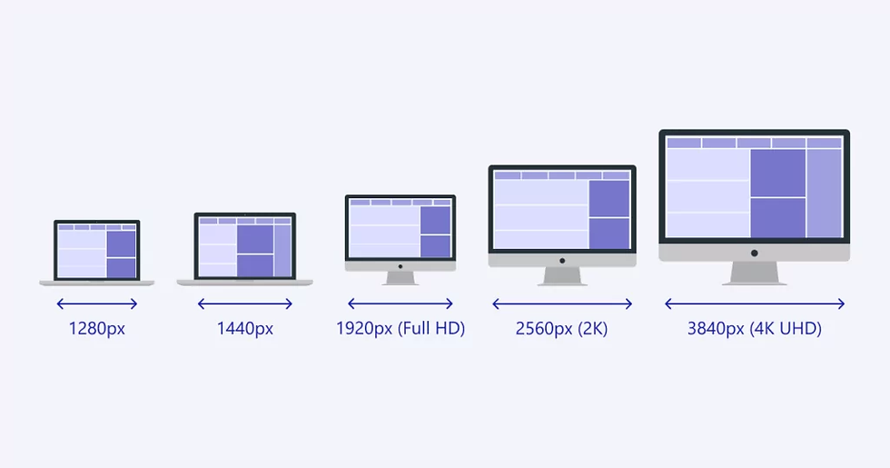
Common desktop viewport widths can range from approximately 1024px to 1920px and beyond, depending on the computer, monitor, browser window, and user settings.
There is no universal standard laptop screen size px value.
Laptops commonly use resolutions such as 1366 × 768, 1920 × 1080, 2560 × 1440, and higher, but the browser viewport can differ because of operating-system scaling, browser controls, zoom, and window size.
This is why designing a website specifically around one laptop resolution is rarely a good long-term strategy.
Instead, your website should use responsive containers and breakpoints that allow the content to reorganize whenever the available space changes.
The most effective typical screen sizes for web design are therefore better understood as ranges rather than individual resolutions.
A website might have a maximum content width of 1200px or 1400px while allowing the surrounding background to expand across larger displays.
This prevents paragraphs from becoming excessively wide.
Imagine a website that stretches a 2,000px-wide paragraph across an ultrawide monitor. Even though technically everything fits, reading the content becomes uncomfortable because the eye has to travel too far from one side of the line to the other.
Responsive design solves this by allowing the outer layout to expand while keeping important content within comfortable reading widths.
Responsive Website Dimensions on Desktop
Good responsive website dimensions balance flexibility with readability.
A typical structure might allow a website's outer container to occupy most of the available viewport while limiting the maximum width of the primary content.
For example, a website could use a full-width hero section while keeping the hero's text and call-to-action within a constrained content container.
This creates visual impact on large screens without forcing visitors to read extremely wide text blocks.
It also gives designers more control over hierarchy, whitespace, imagery, and conversion elements.

Large & Ultrawide Screens
Modern websites also need to account for increasingly large displays.
Large monitors and ultrawide screens can provide significantly more horizontal space than traditional laptops, creating another challenge for responsive web design.
If a website simply stretches every element to fill the available width, the result can feel sparse, oversized, or difficult to navigate.
This is where understanding different screen sizes for responsive design becomes particularly important.
The solution is generally not to create an entirely separate website for large monitors.
Instead, responsive layouts should have sensible maximum widths.
For example, a website may allow its background, navigation, and visual sections to span the full viewport while keeping the primary content inside a centred container.
This approach creates consistency across a wide range of web design screen sizes.
A visitor using a 1440px display and another using a 3440px ultrawide monitor can therefore see the same underlying design system while experiencing layouts that appropriately use the space available to them.
Ultrawide screens can expose weaknesses in layouts that were designed around a single desktop resolution.
A hero section that looks balanced at 1440px may suddenly have enormous empty areas when displayed at 3440px.
This does not necessarily mean the design needs more content.
Often, the better solution is to establish maximum widths for text, navigation, cards, and other key components while using imagery, background treatments, and whitespace intentionally around them.
Responsive design is not about filling every available pixel.
It is about using available space in a way that improves the visitor's experience.
Responsive Design Should Adapt Between Screens, Not Just At Them
The most important principle to remember when evaluating different screen sizes for responsive design is that users do not only visit websites at predefined breakpoint widths.
Someone might resize their desktop browser.
They might use split-screen mode.
They might rotate a tablet.
They might zoom in.
They might have accessibility settings enabled.
They might browse from a device that did not exist when the original website was designed.
A genuinely responsive website accounts for this variability by allowing layouts to change fluidly between major breakpoints rather than assuming that visitors will always use a handful of predetermined screen sizes.

Common Website Screen Sizes & Resolutions
Responsive websites need to work across far more than one desktop monitor or smartphone.
People access websites from phones, tablets, laptops, desktop monitors, ultrawide displays, and devices with different browser zoom levels and operating-system settings.
That makes choosing screen sizes for responsive design targets less about designing for a handful of exact devices and more about creating a flexible layout that adapts smoothly as the available viewport changes.
Understanding the common screen sizes for responsive design can still be extremely useful. These sizes give designers and developers practical reference points for testing layouts, identifying potential problems, and establishing responsive behaviour.
The important distinction is that screen resolution is not the same as browser viewport size. A device might have a high-resolution display, but the website is rendered within the browser's available CSS viewport, which can be significantly different.

Most Common Mobile Screen Sizes
Mobile devices create some of the most important constraints in responsive web design. A website that looks excellent on a large monitor can become difficult to navigate when the same content is compressed into a narrow mobile viewport.
When considering the mobile phone screen sizes for web design, designers should focus primarily on the width available to the browser rather than designing specifically around individual phone models.
This is because there are thousands of smartphone models, and new devices are released regularly. Designing a separate layout for every device is inefficient and can quickly create an outdated website.
Standard Mobile Screen Size in Pixels
There is no universal standard mobile screen size in pixels because smartphones have different physical dimensions, resolutions, pixel densities, and browser viewport configurations.
For responsive web design, CSS pixels are much more useful than the device's physical display resolution.
Common mobile testing widths include approximately:
320px–375px: Small mobile layouts
375px–390px: Common modern smartphone widths
390px–430px: Larger smartphone layouts
These should be treated as testing ranges rather than rigid design specifications.
A strong responsive website should also behave correctly between these widths. If a layout works at 375px and 430px but breaks at 402px, the design is not truly responsive.
What Is the Smallest Screen Size for Responsive Design?
There is no single smallest screen size for responsive design that every website must support.
Historically, designers often used very small mobile widths as a baseline, but modern responsive development is better approached by identifying where the design itself begins to break rather than selecting an arbitrary device width.
A practical starting point is to test narrow mobile viewports around 320px to 375px wide, while ensuring the layout remains usable at larger mobile widths such as 390px, 414px, and beyond.
The goal is not to make every element fit perfectly into a particular number. The goal is to ensure that the website remains readable, navigable, and functional when space is limited.
When developing mobile-responsive design sizes, test more than the homepage.
Important pages such as service pages, contact forms, pricing pages, blog articles, product pages, and landing pages can behave very differently on smaller screens.
Pay particular attention to elements that commonly create problems, including navigation menus, large headings, forms, tables, buttons, image galleries, pop-ups, and horizontally arranged content.
A mobile visitor should never have to pinch and zoom simply to read your website or complete an important action.
Most Common Tablet Screen Sizes
Tablets sit between smartphones and traditional computers, which makes them especially important when establishing common screen sizes for web design.
A tablet can provide substantially more space than a smartphone while still being used primarily through touch. That means a design cannot simply be treated as a smaller desktop website.
For tablet screen sizes for responsive design, both portrait and landscape orientations should be considered.
A tablet displayed vertically may provide a relatively narrow viewport, while the same device turned horizontally can provide enough space for multi-column layouts, expanded navigation, and larger visual elements.
Common Tablet Screen Sizes for Responsive Design
Common tablet testing ranges generally fall around:
600px–768px: Smaller tablets and portrait layouts
768px–834px: Common tablet portrait widths
834px–1024px: Larger tablets and landscape layouts
1024px+: Larger tablet and hybrid device layouts
These numbers are useful for testing, but they should not become hard rules for every website.
The correct breakpoint depends on what the content needs.
For example, if a three-column service section becomes difficult to read at 920px, there is no reason to wait until a specific device breakpoint before changing it. The layout should adapt when the content requires more space.
When thinking about tablet website dimensions, remember that a tablet does not have one fixed orientation.
A tablet website may need to support a narrow portrait viewport and a substantially wider landscape viewport without compromising usability.

Most Common Desktop Screen Sizes
Desktop environments provide significantly more horizontal space, but that does not mean a website should simply stretch indefinitely across the screen.
Understanding common desktop screen sizes helps designers test layouts across laptops, standard desktop monitors, high-resolution displays, and larger screens.
The purpose of testing desktop screen sizes for responsive design is not to create a separate version of the website for every monitor.
Instead, designers should determine how the website behaves as the viewport grows.
A website might use a maximum content width of around 1,200–1,400px while allowing the background, imagery, or other visual elements to extend further across the screen.
This prevents text from becoming excessively wide.
Imagine a blog article stretching across a 2,500px monitor with no maximum width. Each line could contain so many words that reading becomes uncomfortable. A constrained content container creates a more controlled reading experience while still taking advantage of the larger display.
Common Desktop Screen Sizes for Responsive Design
Common desktop viewport widths frequently encountered during responsive testing include approximately:
1024px–1280px: Smaller laptops and desktop layouts
1280px–1440px: Common laptop and desktop widths
1440px–1920px: Larger desktop monitors
1920px+: High-resolution and large desktop displays
The exact available width can vary depending on browser chrome, operating-system scaling, zoom settings, and the user's configuration.
There are no universally correct standard screen sizes for web design.
Instead, responsive design typically combines flexible layouts with strategic maximum widths and breakpoints.
A common approach is to establish a content container that grows until reaching a maximum width, while individual components respond independently as the viewport changes.
This approach is more future-proof than designing specifically for today's most popular monitor.
New devices will continue to introduce different dimensions and aspect ratios. A website built around rigid device-specific layouts can quickly become difficult to maintain.
Standard Responsive Breakpoints
Standard responsive breakpoints are viewport widths at which a website's layout changes to better accommodate the available space.
For example, a website might use a layout similar to:
Below ~576px: Small mobile layout
~576px–767px: Larger mobile layout
~768px–991px: Tablet layout
~992px–1199px: Smaller desktop or tablet landscape layout
~1200px+: Desktop layout
These numbers are common starting points, but they should never be treated as universal requirements.
The better approach is content-based breakpoints.
If a navigation bar becomes crowded at 980px, the menu should change before the content becomes unusable. If a two-column layout still looks excellent at 760px, there may be no reason to stack it simply because a traditional breakpoint has been reached.
This is one of the most important principles behind effective responsive design screen sizes: breakpoints should respond to the design, not arbitrary device categories.
A responsive website should feel intentional at every width, not like a collection of desktop, tablet, and mobile versions stitched together.

Mobile-First vs. Desktop-First Responsive Design
When planning screen sizes for responsive web design, there are two common approaches developers and designers use to determine how a website should adapt across devices: mobile-first and desktop-first design.
Both approaches can produce an effective responsive website when implemented correctly. The difference is where the design process begins and how the layout responds as the available screen space changes.
Understanding these approaches is important because responsive website screen sizes are not simply a collection of fixed device dimensions. A truly responsive website should be able to adapt continuously between different viewport widths while maintaining usability, readability, performance, and visual consistency.
For most modern websites, a mobile-first approach provides a stronger foundation. However, understanding both methodologies will help you make better decisions when planning your website's responsive behaviour.

What Is Mobile-First?
Mobile-first web design means designing and developing the website for smaller screens first, then progressively enhancing the experience as more screen space becomes available.
Instead of starting with a large desktop layout and trying to make it fit on a phone, the process begins with the most constrained environment.
This forces the design to prioritize what actually matters.
Navigation, content hierarchy, calls to action, forms, images, typography, and interactive elements all need to work within a limited amount of horizontal space.
Once the core experience works well on mobile, additional layout features can be introduced for tablets, laptops, and larger desktop displays.
Understanding Mobile Size for Responsive Design
There is no single mobile size for responsive design that every website should use.
Modern smartphones come in many different viewport dimensions, and users can also rotate their devices between portrait and landscape orientations. Designing for one specific phone width can therefore create a fragile website that works perfectly at one size but poorly at another.
A better approach is to establish a flexible mobile foundation.
For example, a design might begin with a narrow viewport and use fluid widths, flexible spacing, responsive typography, and adaptable images. The layout can then expand naturally as the available space increases.
This is one of the most important principles behind responsive design: design for screen ranges rather than individual devices.
How Responsive Screen Sizes Breakpoints Work
Responsive screen size breakpoints are points at which a website's layout changes because the available viewport width has reached a particular threshold.
For example, a navigation menu might display as a compact mobile menu at smaller widths but switch to a horizontal navigation bar once enough space is available.
Similarly, a single-column content section might become a two-column layout on a tablet or a three-column layout on a desktop.
The exact breakpoint should be determined by the content rather than by blindly following a list of popular devices.
If a heading wraps awkwardly at a particular width, a navigation menu becomes crowded, or two columns become too narrow to remain readable, that may be a better breakpoint than a predetermined device dimension.
This approach creates a more resilient website because the layout responds to when the design needs to change, not simply when a particular phone or laptop model happens to exist.

What Is Desktop-First?
Desktop-first web design takes the opposite approach.
The website is initially designed around a larger screen, typically creating the full desktop experience first. The layout is then progressively adjusted, simplified, or reorganized as the viewport becomes smaller.
This approach was particularly common when desktop computers represented the primary way people accessed websites.
A desktop layout provides plenty of room for navigation, large imagery, multiple columns, detailed content sections, and complex interfaces. Designers could establish the complete experience and then determine how those elements should behave on smaller screens.
Choosing a Desktop Screen Size for Web Design
There is no universal desktop screen size for web design.
Desktop users may have relatively small laptop displays, large external monitors, ultrawide screens, or high-resolution displays. A website designed around one specific desktop resolution can therefore become unnecessarily restrictive.
Instead, modern websites should generally use a flexible maximum content width combined with fluid layouts.
For example, a website might allow its background and overall page structure to expand across a large monitor while keeping the primary content within a comfortable reading width.
This prevents an important problem with large-screen design: simply making everything wider does not necessarily create a better experience.
A 27-inch monitor can provide significantly more horizontal space than a laptop, but a paragraph stretching across the entire screen can become difficult to read. Responsive design should therefore control how content uses available space, not just whether it technically fits.
In these situations, the desktop experience may need to establish the core functionality before the team determines which elements can be condensed or reorganized for smaller screens.
The important consideration is not whether a website is technically desktop-first or mobile-first. It is whether the final experience works effectively across the full range of website screen sizes your audience uses.
Which Is Better?
For most business websites, mobile-first responsive design is the stronger starting point.
That does not mean desktop is less important. It means the website's fundamental structure is established around the most constrained environment before additional space is used to enhance the experience.
Starting with mobile encourages businesses to prioritize essential information, simplify navigation, reduce unnecessary design elements, and create clearer calls to action.
Those decisions can ultimately improve the desktop experience as well.
A common mistake is to think of responsive design as "making the desktop website work on mobile." That approach often results in excessive scrolling, tiny text, cramped buttons, awkward navigation, or desktop components simply stacked on top of one another.
Choosing mobile-first does not mean designing only for smartphones.
The goal is to establish a strong foundation and then progressively enhance it as additional screen space becomes available.
A well-designed website may use one layout at a narrow mobile width, another arrangement at tablet widths, and a more expansive composition on desktop. However, these should feel like different expressions of the same system rather than completely separate websites.
This is particularly important for Canadian businesses serving customers across different devices.
Someone may discover your company through Google on their phone, research your services later on a laptop, and eventually return on a tablet to submit a form or make a purchase.
The experience should remain consistent throughout that journey.
The biggest takeaway when comparing website screen sizes is that responsive design should not be built around a rigid list of devices.
Phones, tablets, laptops, desktop monitors, foldable devices, browser windows, and accessibility settings all create different viewing conditions.
Instead of designing dozens of individual versions of a website, businesses should build a flexible system that responds to the available space.
That means using fluid containers, flexible grids, responsive images, scalable typography, appropriate breakpoints, and layouts that can accommodate content changes.
This approach also makes future maintenance easier. When a new device enters the market, the website does not necessarily require an entirely new design. If the underlying responsive system is well constructed, the layout can adapt automatically.
How to Design a Website for Different Screen Sizes
Designing a website for different devices is about more than making a desktop website “shrink” on smaller screens.
A well-designed responsive website should adapt its layout, typography, navigation, images, spacing, and interactive elements based on the available screen space.
There is no single screen size that every website needs to be designed for. Instead, modern websites should use flexible layouts that respond naturally to different viewport widths while still providing a consistent experience.
Understanding standard website screen sizes can help establish a starting point, but the goal should always be to design for the content and user experience rather than a specific device.
This approach should be considered throughout your Website Design Process Steps, from initial wireframing and content structure through development, testing, and launch.
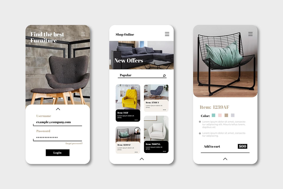
Use a Mobile-First Layout
A mobile-first approach means designing the smallest version of your website before expanding the layout for larger screens.
Rather than starting with a large desktop canvas and trying to remove elements as the screen gets smaller, you establish a strong foundation for mobile and progressively introduce additional space, columns, features, and visual elements as the viewport grows.
This is particularly important because mobile users often have less available space and interact with websites differently than desktop users.
When planning responsive design screen sizes, consider what information someone actually needs when viewing your website on a narrow screen.
A visitor should not have to zoom, horizontally scroll, or navigate through an overcrowded interface to find an important piece of information.
Start With the Mobile Layout First
A mobile-first layout does not mean designing exclusively for one particular phone width.
Instead, begin with a constrained layout where your most important content, calls to action, navigation, forms, and interactive elements work comfortably within a small viewport.
From there, the layout can progressively expand as more horizontal space becomes available.
For example, a three-column services section might become a single-column stack on mobile, two columns on a tablet, and three columns on a larger desktop display.
The content remains the same, but its presentation changes according to the available space.
Avoid Designing Around Specific Devices
It can be tempting to create designs specifically for an iPhone, iPad, laptop, or large desktop monitor.
However, device-specific design quickly becomes difficult to maintain because new devices and screen dimensions are constantly being introduced.
Instead, use flexible layouts and website breakpoints based on where your design actually needs to change.
A breakpoint should exist because the content or layout requires it, not simply because a particular device has that screen width.

Use Responsive Breakpoints
Responsive breakpoints are viewport widths where a website's layout changes to maintain usability and visual consistency.
They are an important part of understanding css responsive design screen sizes, because CSS media queries can modify layouts, typography, spacing, navigation, and other components when the available viewport reaches a particular threshold.
There is no universal set of screen sizes for responsive design that every website must follow.
Common starting points might include mobile, tablet, laptop, and desktop ranges, but the exact values should be determined by the website's content.
For example, if a navigation menu begins wrapping at 920px, that may be a better breakpoint for your website than a conventional 768px or 1024px breakpoint.
Design Breakpoints Around Content
The best responsive web design breakpoints are content-driven.
Imagine a website's navigation contains a logo, six menu links, and a prominent contact button. At a particular width, those elements may no longer fit comfortably on one line.
That is the point where the navigation should change, not necessarily when the viewport reaches the width of a particular tablet.
The same principle applies to grids, pricing tables, forms, hero sections, and other components.
This creates a more resilient design that works across devices that did not exist when the website was originally built.
Use CSS Media Queries Strategically
CSS responsive breakpoints allow developers to apply different styles depending on the viewport.
A layout might begin with a single-column mobile structure and then introduce additional columns as more space becomes available.
The important consideration is not how many media queries a website has, but whether each breakpoint solves a genuine design problem.
Too many breakpoints can make a website unnecessarily complicated and difficult to maintain.
Too few can result in awkward transitions where content becomes cramped or difficult to use.

Use a Responsive Website Builder
The technology used to build a website can have a major impact on how easily it adapts to different screen sizes.
A responsive website builder can provide flexible grids, responsive controls, fluid sizing, breakpoint management, and reusable components that make it easier to create layouts that work across devices.
However, the platform itself does not automatically guarantee good responsive design.
A website can technically be responsive while still having poor mobile spacing, oversized typography, difficult navigation, or awkwardly positioned elements.
Choosing the right platform should therefore depend on your business requirements, content, functionality, scalability, and ability to manage the website over time.
Our guide to the Best Website Builder Platforms explores how different platforms compare and which types of businesses they may be best suited for.
Test the Builder's Responsive Controls
Before committing to a platform, examine how it handles responsive layouts.
You should be able to adjust layouts for different viewport widths without creating completely separate versions of every page.
Look for functionality such as flexible containers, responsive typography, adjustable spacing, grid controls, breakpoint settings, image behaviour, and mobile-specific navigation.
A strong platform should make responsive design easier, not force you to work around limitations.
Apply Responsive Design Principles
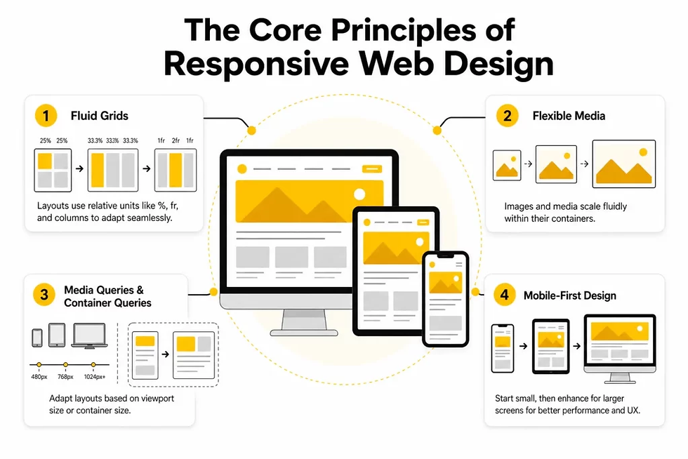
Responsive design works best when the entire website is built around flexibility rather than relying on a handful of device-specific layouts.
Elements should be able to grow, shrink, stack, wrap, and reposition as the available space changes.
This is where responsive breakpoints for websites work alongside fluid layouts.
For example, a content section could use a flexible grid that automatically adjusts the number of columns based on available width. Images can scale within their containers, while text can reflow naturally instead of being positioned at fixed coordinates.
Use Flexible Containers
Avoid relying heavily on fixed-width containers for major sections of a website.
Instead, combine flexible widths with maximum widths, padding, and margins.
This allows a section to use the available viewport efficiently while preventing content from becoming excessively wide on large displays.
The result is a layout that feels intentional across everything from a narrow smartphone to a large desktop monitor.
Make Images and Media Responsive
Images should generally scale within their containers rather than forcing the page to become wider than the viewport.
Responsive images also need to maintain appropriate aspect ratios and sufficient quality across different display sizes.
Large background images and videos should receive particular attention because they can significantly affect both page performance and visual presentation.
A responsive website should not simply make everything smaller. It should determine how each component should behave as the available space changes.

Use Responsive Typography
Typography is another major consideration when designing for different screen sizes.
A heading that looks balanced on a 27-inch monitor may become enormous on a smartphone, while body text that looks comfortable on desktop may become difficult to read if the line length and spacing are not adjusted properly.
Responsive typography allows font sizes, line heights, and spacing to adapt as the viewport changes.
Rather than creating completely separate typography systems for every device, consider using fluid sizing where appropriate.
A large headline might gradually increase as the viewport becomes wider instead of jumping dramatically between several fixed sizes.
Prioritize Readability Over Scale
Responsive typography should always serve readability.
On smaller screens, headings may need to become smaller and line heights may need adjustment to prevent excessive vertical space.
On larger displays, typography can increase while still maintaining a comfortable reading width.
The goal is not to make text proportionally identical across every device. The goal is to maintain a clear hierarchy and comfortable reading experience regardless of screen size.

Use Responsive Navigation
Navigation is one of the most visible components affected by screen size.
A horizontal desktop navigation with multiple links and a prominent CTA may work perfectly on a wide screen but become crowded as the viewport narrows.
Responsive navigation allows the interface to change while maintaining access to the same core pages and actions.
For example, desktop navigation might display the full menu, while mobile navigation could consolidate those links into a menu button or another compact interface.
The transition should be intentional and easy to understand.
Your navigation should also follow the principles outlined in our guide to Best Practices for Website Navigation, particularly around hierarchy, labels, accessibility, and helping visitors quickly understand where they are within the website.
Keep Important Actions Accessible
Responsive navigation should not hide every important action behind multiple interactions.
If booking a consultation, requesting a quote, making a purchase, or contacting the business is a primary conversion goal, consider how easily visitors can access that action on smaller screens.
The navigation may change visually, but the website's most important user journeys should remain straightforward.

Apply Maximum Content Width
Large monitors create another responsive design challenge: excessive horizontal space.
Without a maximum content width, text and other elements can stretch across an enormous screen, creating long lines and making the website feel visually disconnected.
This is why website dimensions for responsive design should account for both minimum and maximum available space.
A website can be fluid while still placing reasonable limits on how wide its content becomes.
Consider a paragraph displayed across a 2,500-pixel-wide monitor.
Even though the layout technically fits the screen, the resulting line length may be so long that the content becomes difficult to read.
A maximum-width container can keep the text and supporting elements within a more comfortable reading area while allowing the surrounding background to continue filling the viewport.
This creates a visual structure where the website feels spacious without becoming stretched.
Maximum-width containers also help establish consistent alignment throughout the website.
Your hero section, headings, paragraphs, service sections, images, forms, and calls to action can share a common content boundary.
This gives the website a stronger visual hierarchy and makes the design feel deliberate across different screen sizes.
Ultimately, responsive design is not about predicting every possible screen size. It is about creating a flexible system that can adapt to the screens your customers actually use.
By combining a mobile-first layout, content-driven breakpoints, responsive typography and navigation, flexible components, and sensible maximum widths, your website can remain usable and visually consistent as devices and screen sizes continue to change.
Conclusion
Choosing the right responsive web design screen sizes is not about designing a website for one specific phone, tablet, laptop, or desktop monitor.
It is about creating a flexible website that can adapt to the wide range of devices, browsers, orientations, and screen dimensions your customers use every day.
There is no single list of website screen sizes for responsive design that will work perfectly for every business.
Instead, your website should use flexible layouts, responsive typography, scalable images, appropriate breakpoints, and content that naturally adapts as the available screen space changes.
The most effective responsive website screen sizes strategy starts with your audience. Instead of asking which devices you should design for, consider how your customers actually interact with your website.
A local service business may receive the majority of its traffic from mobile users searching for a phone number, directions, or a booking form. A B2B company may see more desktop traffic from professionals researching its services during the workday.
Your website should accommodate both experiences without forcing users to zoom, scroll horizontally, struggle with navigation, or search for important information.
Responsive design does not end when a website looks good on your own computer. A website can appear perfect on one screen while having spacing, navigation, image, typography, or usability problems at another width.
That is why testing is an essential part of responsive web design. Once your website is built, review how layouts, content, buttons, forms, navigation, and images behave at different viewport widths.
For a more detailed walkthrough, read our guide on How to Test a Website is Responsive to learn how to identify common responsive design issues before they affect your visitors.
If you are still planning your website, our guide on How to Create a Website for a Business can help you understand the broader process, from defining your goals and planning your pages to building a website that supports long-term growth.
Frequently Asked Questions (FAQ)
What screen sizes should a responsive website support?
A responsive website should support a wide range of screen sizes, rather than being designed around a fixed list of devices.
At a minimum, modern websites should provide a strong experience across mobile, tablet, laptop, and desktop screen sizes. This commonly means testing widths from approximately 320px on smaller smartphones through 1440px and beyond on larger desktop displays.
The important consideration is not simply whether a website technically fits on a screen. Its navigation, text, buttons, images, spacing, forms, and content should remain usable and visually balanced as the viewport changes.
A well-built responsive website uses flexible layouts that adapt between these sizes instead of creating an entirely separate website for every device.
What are the most common screen sizes for modern websites?
There is no single “standard” screen size that every website should be designed around.
Modern websites are accessed from smartphones, tablets, laptops, desktop monitors, and increasingly large high-resolution displays. Screen widths can also vary depending on browser windows, split-screen usage, device orientation, and browser UI.
For this reason, responsive web design focuses more on viewport widths and layout behaviour than on specific device models.
Common testing widths may include approximately 320px, 375px, 390px, 414px, 768px, 1024px, 1280px, 1440px, and 1920px, but these should be treated as testing references rather than mandatory design targets.
What screen sizes should I design a website for?
You should design your website for content and usability first, rather than individual devices.
Start by designing a flexible layout that works well at common mobile widths, then expand the layout for tablets and larger screens. As the available space increases, elements such as navigation, columns, imagery, and content sections can progressively adapt.
For a business website, it is particularly important to test the screens your customers are actually using. Analytics can provide valuable information about your audience's devices and screen dimensions, allowing you to prioritize real-world usage instead of relying entirely on generic device lists.
What are the best screen sizes for responsive web design?
The best screen sizes for responsive web design are not specific screen sizes at all. The goal is to create a layout that works across a range of viewport widths.
A practical responsive design process may include testing small mobile screens, larger smartphones, tablets, laptops, standard desktop monitors, and large desktop displays.
The breakpoint should be introduced when the content needs to change, not simply because a particular device reaches a predetermined width.
For example, if your navigation begins wrapping or your three-column layout becomes difficult to read, that is a better reason to introduce a breakpoint than simply saying, “This is the tablet breakpoint.”
What are the standard breakpoints for responsive web design?
There are no universal standard breakpoints that every responsive website must use.
Historically, developers have commonly worked with ranges such as 576px, 768px, 992px, 1200px, and 1400px. These values can still be useful depending on the framework or design system being used, but they are not requirements.
Modern responsive design increasingly uses content-driven breakpoints. Instead of asking which breakpoint corresponds to an iPhone, tablet, or desktop, designers ask when the current layout stops working effectively.
This produces websites that are more adaptable to devices that did not exist when the original design was created.
What breakpoints should I use for a responsive website?
The breakpoints you use should depend on your website's layout, content, typography, navigation, and components.
For example, a website might use one breakpoint when its desktop navigation no longer fits comfortably, another when a multi-column section becomes too narrow, and another when spacing or typography needs to change.
A common starting point is to test around mobile widths, approximately 768px for tablet-sized layouts, and 1024px or larger for desktop layouts. However, these should be adjusted based on the actual design.
The best breakpoint is the point where the user experience starts to deteriorate, not necessarily a specific device width.
What screen width should I use for mobile, tablet, and desktop breakpoints?
Mobile: approximately 320px–767px
Tablet: approximately 768px–1023px
Desktop: approximately 1024px and above
These ranges are useful for planning and testing, but responsive layouts should not be restricted to them.
A website should still behave correctly at widths between these categories. Someone resizing a desktop browser to 900px should not suddenly receive a broken layout simply because 900px was not included in the original design plan.
What is the most common mobile screen size for website design?
There is no single mobile screen size that represents every smartphone user.
Many modern smartphones have viewport widths in the general range of 360px to 430px, although smaller and larger widths also exist. Device pixel dimensions can also be misleading because CSS viewport dimensions are different from the physical pixel resolution of a display.
For website design, it is therefore more useful to test several common mobile viewport widths rather than designing exclusively for one phone.
The most important goal is making sure the website remains easy to navigate and read without horizontal scrolling, regardless of the user's specific device.
What are the most common tablet screen sizes for web design?
Tablet layouts commonly fall around 768px and above, with larger tablet and landscape configurations extending considerably wider.
However, tablets can be used in both portrait and landscape orientations, meaning the same device can present dramatically different viewport widths.
A responsive website should account for these changes rather than assuming that every tablet user will view the site in the same orientation.
This is especially important for layouts containing grids, tables, navigation menus, forms, and other components that can become difficult to use when the available width changes.
What are the most common desktop screen sizes for website design?
Desktop and laptop websites are commonly viewed across widths ranging from approximately 1024px to 1920px or wider.
However, a user's browser window may be considerably narrower than their physical monitor. Someone with a 1920px monitor might have their browser open at 1200px, for example.
This is why designing only for a 1920px-wide monitor can create problems. A website should use a flexible layout and, where appropriate, a maximum content width to keep text and other content from becoming excessively stretched.
For many business websites, the content itself does not need to span the entire width of a large monitor.
Should a website use a fixed width or responsive width?
A modern website should generally use a responsive or fluid layout, rather than a fixed-width layout.
Fixed-width websites can create horizontal scrolling on smaller screens and leave excessive empty space on larger screens. They also make it harder for content to adapt naturally between different viewport sizes.
Responsive layouts allow elements to resize, reposition, stack, or otherwise adapt according to the available space.
That does not mean every element should stretch indefinitely. A responsive website can combine fluid widths with maximum widths to maintain both flexibility and readability.
What is the ideal website width in pixels?
There is no universal ideal website width in pixels.
Instead, individual elements should have widths appropriate to their content and purpose. The overall page can remain fluid while the primary content area uses a maximum width to prevent excessive line lengths.
For example, a website might allow its background and visual sections to span the full browser width while keeping the main content inside a constrained container.
This approach creates a better balance between responsive design, readability, visual hierarchy, and usability.
The ideal width is therefore determined by what allows the content to communicate effectively, not by a single pixel value.
What is the difference between screen size and viewport size?
Screen size refers to the physical display dimensions of a device, while the viewport size refers to the area available to the website inside the browser.
These values are not necessarily the same.
A smartphone may have a high physical pixel resolution, but its browser reports a much smaller CSS viewport width. Similarly, someone using a large desktop monitor may resize their browser window so that the website has considerably less space available.
Responsive web design primarily responds to the viewport, because that is the space the website actually has available to display its content.
Understanding this distinction is essential when testing responsive web design screen sizes.
How do I make sure my website looks good on every screen size?
The best approach is to design responsively, test continuously, and evaluate the actual user experience at different viewport widths.
Do not simply check whether the website technically loads on a phone. Look at how the entire experience changes.
Navigation should remain easy to use. Text should remain readable. Buttons should be large enough to interact with. Images should scale appropriately. Forms should remain usable. Columns should stack logically when necessary.
You should also test intermediate widths rather than only checking a few popular devices. A website that looks perfect at 375px and 1440px can still have serious problems at 820px or 1100px.
How can I test whether my website is responsive?
You can test responsiveness by viewing your website at different viewport widths and checking how the layout changes.
Start with small mobile widths, then gradually increase the viewport through tablet, laptop, and desktop sizes. Pay particular attention to navigation, headings, images, buttons, forms, spacing, grids, and any elements that move between columns.
Browser developer tools can also simulate different viewport dimensions, making it easier to identify layout problems without physically owning every device.
However, browser simulation should not be the only test. Whenever possible, test the website on real smartphones, tablets, and computers, because touch interaction, browser behaviour, performance, and device-specific rendering can reveal issues that are difficult to identify in a desktop simulator.


%20-%20Text%20%26%20Icon%20-%20White%20(PNG)_edited.png)
Comments